and the distribution of digital products.
DM Television
Why Smart Design Decisions in Payment Systems Can Save You Millions
Yes, good design can save you millions
No, it’s not “nice to have”.
A case study of the financial impact of smart design decisions in payment systems
\n “Nice to have”?
\ We know that poor design in critical systems leads to mistakes, slowdowns, and unhappy people.
\ Here’s an example. Hawaii’s infamous missile false alarm in 2018 was caused by an employee pushing the wrong button. Why did that happen? Because someone clearly wanted to save money on design. The damage caused more than just panic. It led to trust issues and costly recovery efforts for the government.
\ For some reason, many stakeholders still think design is just decoration.
\ Design often gets dismissed as a “nice-to-have,” something to consider after all the “important” stuff is done. This mindset is especially common in complex systems of fintech, where functionality and technical stability seem to be the priority #1:
\
…there is also very little differentiation between each company. They seem to be all doing the same thing. It’s “another” payment portal/funds transfer/digital wallet, or asset management/trading platform…“perhaps they don’t even know themselves.”
\ But here’s a case study for you — in fintech, there are certain processes that can be improved only through good design. And those are precious moments when design finally shines bright, like… Well, I don’t want to say “diamond” because I will never get that Rihanna song out of my head.
Payment systems are no joke
Payment systems are intricate networks. They route data through a complex web of rules and logic. Routing payments, prioritizing transactions, and managing multiple currencies require sophisticated logic. A single error in routing or data handling can snowball.
What I’m trying to say is that working with payment systems is like working with the Red Queen from Alice in Wonderland. You risk getting your head cut off by a wrong decision.
\ Poor design in such systems can lead not only to user frustration but can also significantly impact profitability. It costs businesses more than lost revenue — it damages their reputation. \n
Can we prevent business losses with design?Yes, by making design decisions that reduce errors.
\ For businesses handling large-scale payments, especially enterprise merchants, payment routing is essential to maximize acceptance rates and reduce transaction costs. Payment routing helps find the best way to send the money. It checks which path will cost the least, be the fastest, and have the best chance of getting through without problems.
\ Now, there are rules for how this works. For example, some rules might say, “If the fastest path doesn’t work, try another route,” while others say, “Use the cheapest way unless the customer is in a hurry.”
\ What’s important here for designers is to understand that all this stuff requires a human to process loads of complex information. Loads.
It’s critical to present this information in a way that simplifies decision-making and reduces the chances of human error. The design here is directly connected with preventing losses.
\ And the designer here is like a company’s accountant, trying to save the product thousands, hundreds of thousands, millions of dollars.
What does the payment routing “interface” usually look like?In traditional systems, payment routing configurations are often managed through static lists, tables, or rule engines. The user interfaces are linear, where rules are typically stacked in a list format.
\ The interface might look like this:
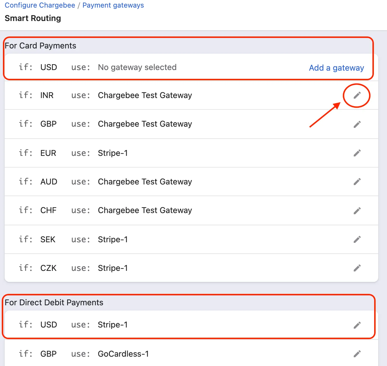
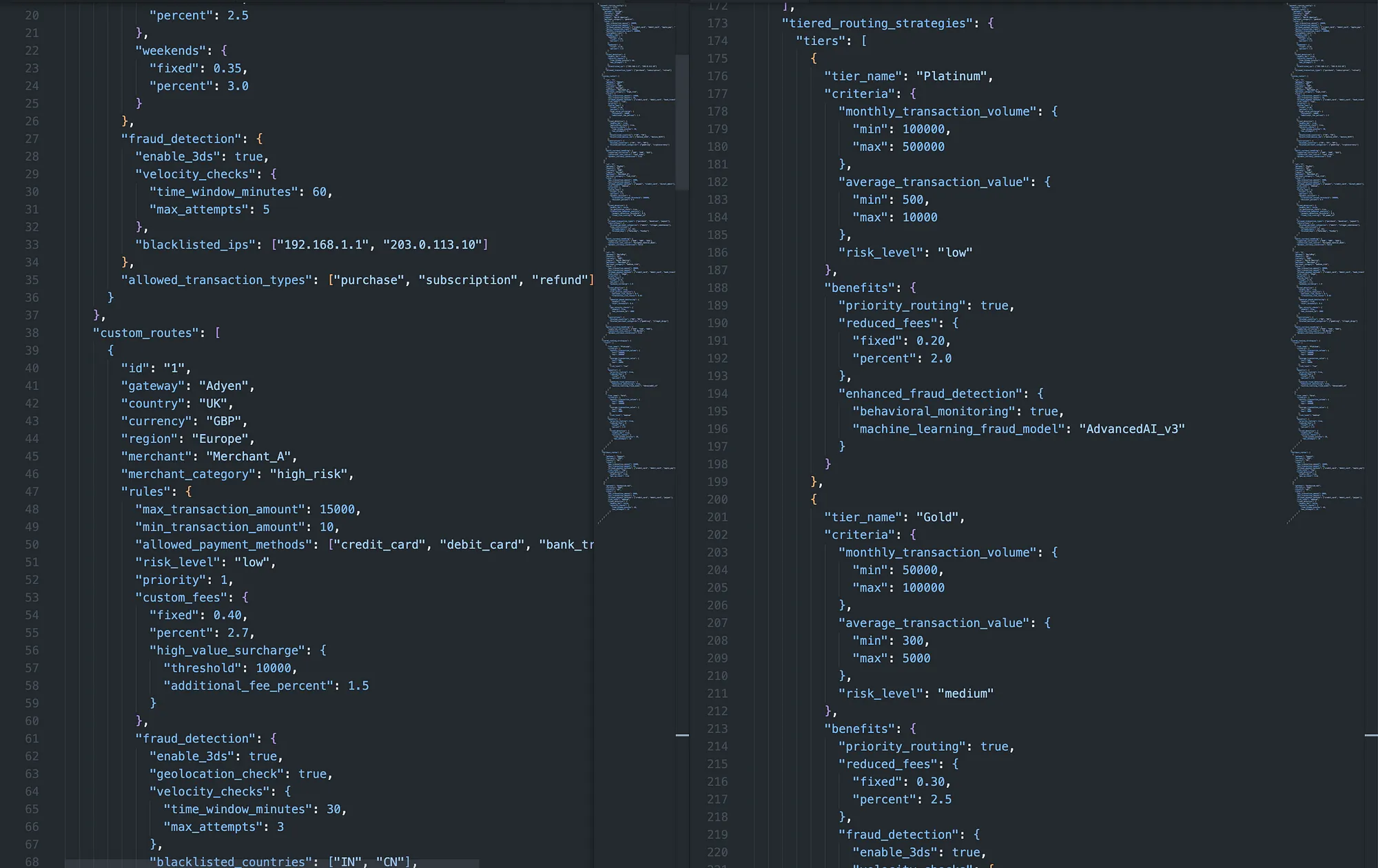
\ But, in reality, it’s usually much worse. Users have to look through a giant Excel spreadsheet or JSON file like this:
\
\
Now, what do we know about users and lists? If there are more than 4–5 items on the list, the readability goes down. This is why it is not recommended to create dropdown lists.
\
The JSON files are unreadable for people with no technical background.
The systems above are not ideal. Instead, I’ve suggested implementing something completely new—a “canvas node system.”
When a designer comes with a “big ask,” — how to defend a completely new approachThe thing is, investing resources into something completely different is difficult to justify. Nine times out of ten, the product management will be happy with just improving what is.
\ After all, why reinvent the wheel when the current one is spinning…?
\ Designers have to defend the value of innovation, especially when that innovation involves a new UI or system that’s dramatically different. It’s not enough to simply say, “It’s better.” You need to align the new approach with both:
- business goals and
- user needs,
- backing it up with research and data.
- \
For instance, the old way of dealing with payment routing through static lists may feel familiar, but the cognitive overload those lists impose is real. Studies from the Nielsen Norman Group show that users don’t read — they scan. So when they’re faced with complex tables and dropdowns, the chance of mistakes skyrockets.
\
We have to ask ourselves: is maintaining the status quo really serving our users and the business?
\ In my situation:
the company could afford the innovation, and, what’s even more important,
the new interface suggested would drastically improve the profitability in the long run.
\
And so, this is how the “canvas-based node system” — a huge, interactive visual mindmap for payment routing — was approved and developed.
Interactive canvas-based node systemThe canvas-based node system flips the traditional approach to payment routing on its head. Instead of forcing users to sift through endless lists or confusing JSON code, it transforms each rule into its own visual “node” that can be easily customized and connected.
A node is essentially a visual representation of a payment rule or a specific function within the payment routing system.
It’s a bit like creating a mind map, where you can see how everything links together in real-time:
\
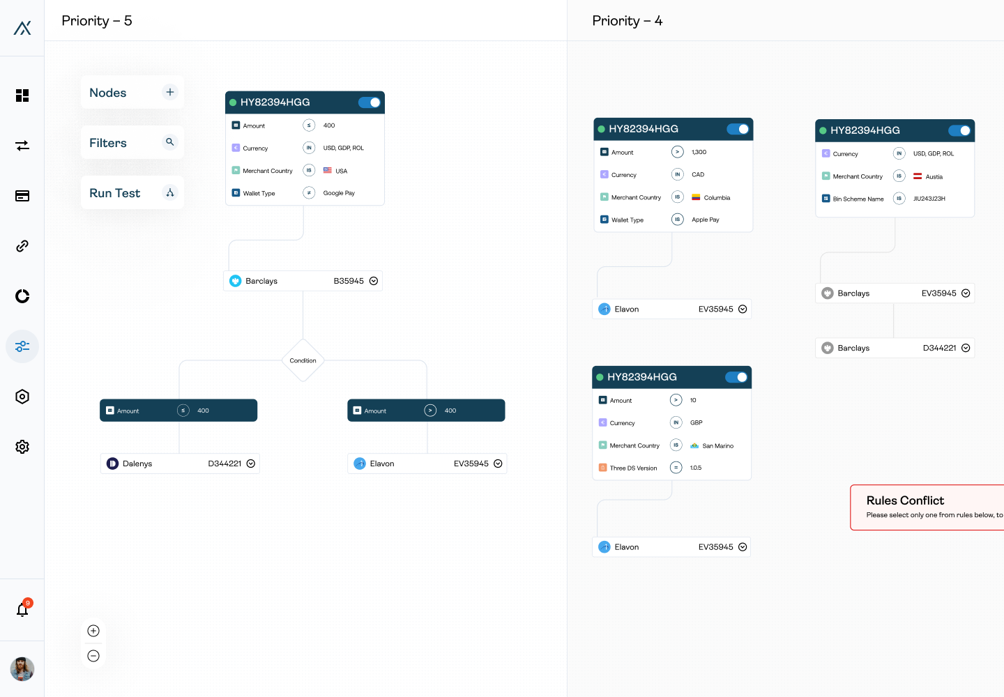
\ Every block (node) you can move, creating your own mind map
\ Why is this better?
\ By laying out the rules visually, users can quickly see how different conditions interact, making it way easier to spot and prevent conflicts or errors. Besides, imagine being able to drag, drop, and link different rules together, just like you’re building with Lego blocks.
That’s what this system offers — complete control over how everything fits:

What, if failed, with, send to — you can create your own system in an instant.
You can literally see the routing strategy take shape. Thanks to design.
Allowing users to choose a.k.a. A/B test nodeWhat makes this design so powerful is its flexibility.
One of the coolest features of this system is the “A/B Test” node:
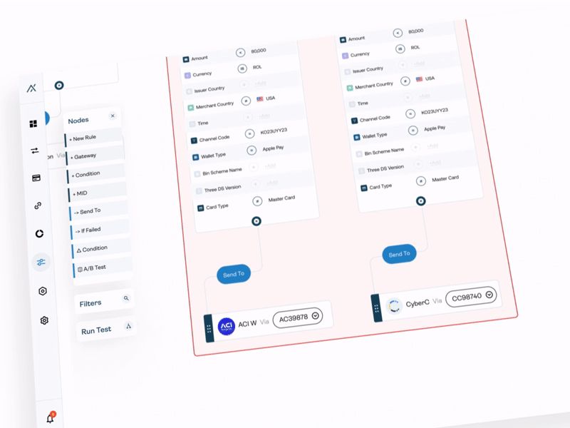
\ \ A/B test node in action + Analytics node
\ Here’s how it works: this node allows users to test different combinations of gateways, operators, and routing rules to see which setup performs better. You can essentially run experiments on your routing flow to find the most efficient path for your payments.
All of the results from these tests get stored in the “Analytics” node.
\ This gives you detailed insights, like the percentage of savings or the accident rate (aka failed transactions) for each scenario you test. So, you’re not just guessing which setup works best — you have the data right there to back it up. Key metrics such as:
- cost savings and
- success rates
show the performance of each A/B test.
\ Since it’s all happening on the canvas, you can connect and disconnect rules or scenarios on the fly. The canvas makes it super easy to connect any rule to the A/B test construction, so the user can always experiment and improve the payment flows.
Good-old zoom is a #1 requested feature in mindmapsThe zoom-in and zoom-out features allow users to navigate and overview huge routing systems. Users can shift between detailed views of individual rules and a broader overview of the entire system:
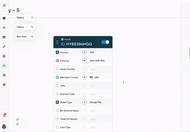
\ \ \
Design can help auto-resolve conflictsImplementing new changes can sometimes lead to rule conflicts — like when two rules contradict each other or overlap in a way that would confuse the payment routing process. Design can help solve those conflicts — and it’s not only about highlighting them in red.
The real magic is the auto-resolve button (I truly wish I had it for everything in life).
\ Instead of manually trying to figure out which rule is more beneficial or needs adjustment, the system analyzes the conflicting rules and automatically chooses the most profitable option for you. It does this by looking at metrics like:
- success rates,
- cost savings, and
- gateway performance
to determine which rule combination is best:
\
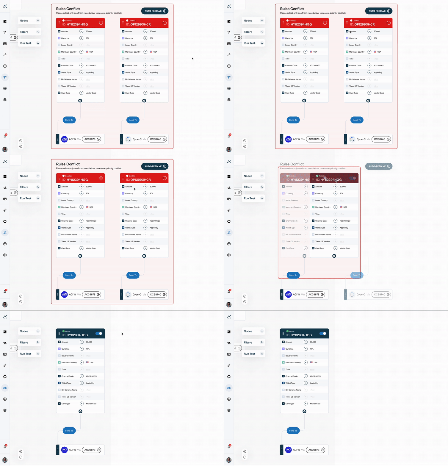
Auto-resolve and conflicts highlighted
Sometimes, the user feels more comfortable with a classic table… and we need to deliverYou know, sometimes, the new systems like our mind map, although ground-breaking, can be overwhelming. So, we need to backtrack a little bit.
\ Users are used to classic systems. Throwing them into a completely new interface, even with onboarding, is cruel. Because they will want to return to something they are used to should any problems arise. That’s why we allow them to take a step back and return to a classic “list” view:
\
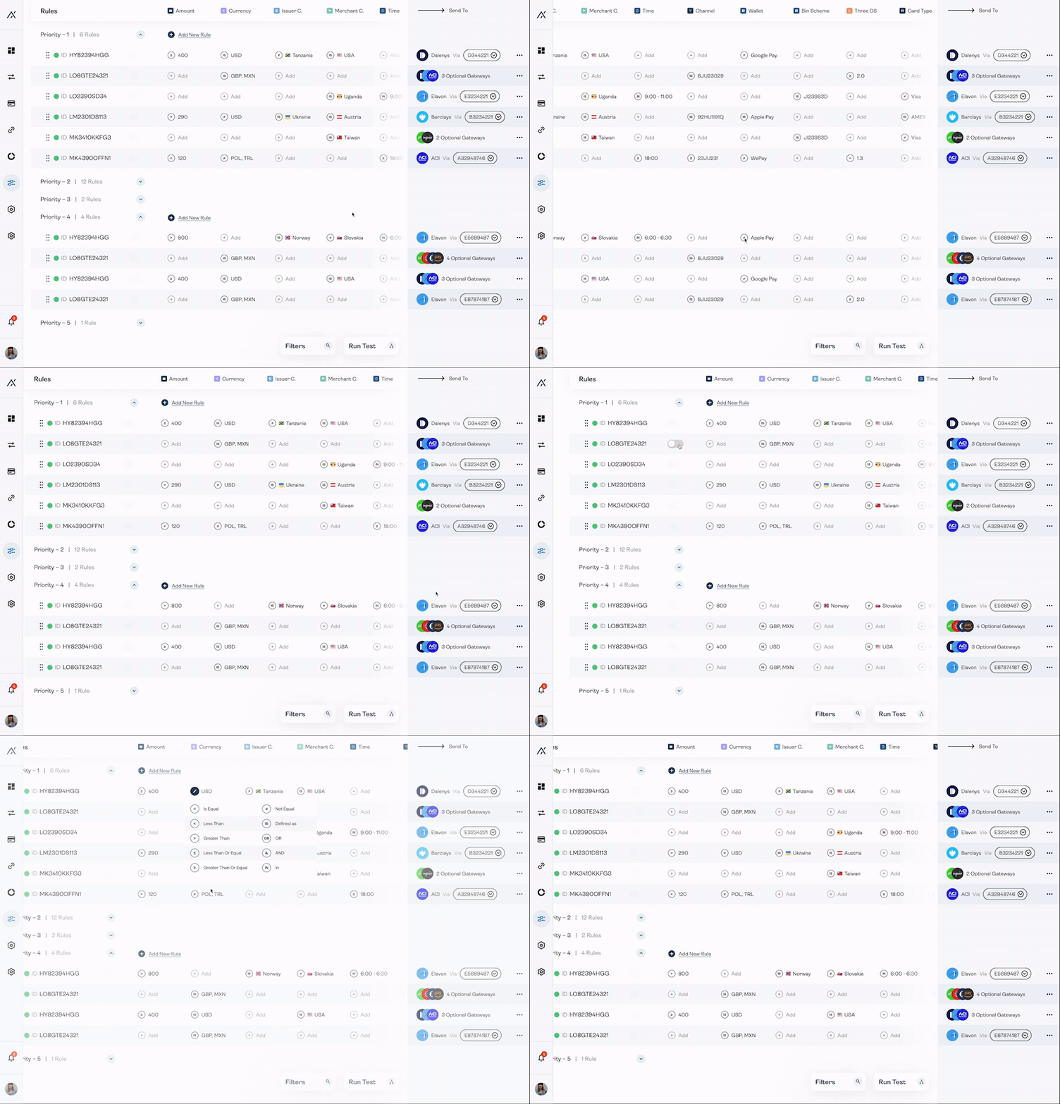
It’s about giving users flexibility and control so they can work in whatever style feels most natural to them, whether that’s the dynamic canvas view or the familiar list view. Plus, it’s a great option for users who need to compare rules at a glance or want a pivoted, high-level overview of all their rules and priorities in a straightforward format.
\ Of course, I also strived to improve the “list” interface as much as I could.
This is how we delivered the best of both worlds.
UX design is an investment, not an expenseDesign shapes users’ experiences. At its core, design is about solving problems and making things work better for users. It goes beyond aesthetics. It improves:
functionality,
usability, and
overall experience.
\
Here’s why design matters:
- It makes things easy to use. Design helps users accomplish their tasks efficiently. If users can’t figure out how to use something, it becomes frustrating, which can lead them to abandon the product or service altogether.
- \
- It saves time and money. In fintech, good design can reduce costly mistakes and save money. It can also improve efficiency. A good payment gateway can reduce transaction errors and avoid losses.
- It builds brand trust. When design solves user problems and makes their experience smooth, customers are more likely to return and stay loyal.
- It acts as a translator between business goals and user needs. Design-thinking processes ensure that user needs are met while also aligning with the company’s strategic goals.
- It can set your product apart. Even if multiple products have the same functionality, the one with a better user experience and design will stand out.
- Great design often pushes boundaries and introduces new ways to solve old problems. It lets designers think outside the box. They find better, more intuitive ways to do tasks.
\ With the case study I presented you, although the design required time and resources to be made, in the end, it saved the companies that use the canvas-based node system millions of dollars (and probably at least a couple of jobs).
\ So please, next time a stakeholder will say something along the lines of “Oh, but we have a product-first and not design-first approach,” give them a (kick) link to this article.
\
- Home
- About Us
- Write For Us / Submit Content
- Advertising And Affiliates
- Feeds And Syndication
- Contact Us
- Login
- Privacy
All Rights Reserved. Copyright , Central Coast Communications, Inc.