and the distribution of digital products.
DM Television
Top 5 Accessibility Issues in U.S. Voter Registration Sites and Ways to Fix Them
Historically, people with disabilities have faced significant barriers to using their right to vote. In the digital age, online voter registration platforms must provide users with high-level accessibility access. High accessibility standards are not optional — they are vital to making democracy work for everyone.
\ However, accessibility barriers could create difficulties for people with disabilities, from registering to vote independently and efficiently to preventing them from casting their votes. A recent report from the Rutgers Program for Disability Research estimated that about 40 million people with disabilities were eligible to vote in 2024. So, the absence of their voting could result in different election outcomes.
\ A recent report, "The State of Web Accessibility for U.S. Voters with Disabilities," by QAwerk, a software testing company, reveals the accessibility level of 43 U.S. online voter registration websites. It shows that 65% of them have medium or low accessibility levels, presenting significant barriers for voters with disabilities.
\ Here are the most common accessibility issues identified by QAwerk's report for over half of the U.S. online voter registration websites.
1. HTML ErrorsThe most prevalent issue identified in the study was the presence of errors in HTML code, which were found for 98% of online voter registration sites. Only one website out of the 43 we tested had no errors in its HTML code. It was Utah.
\
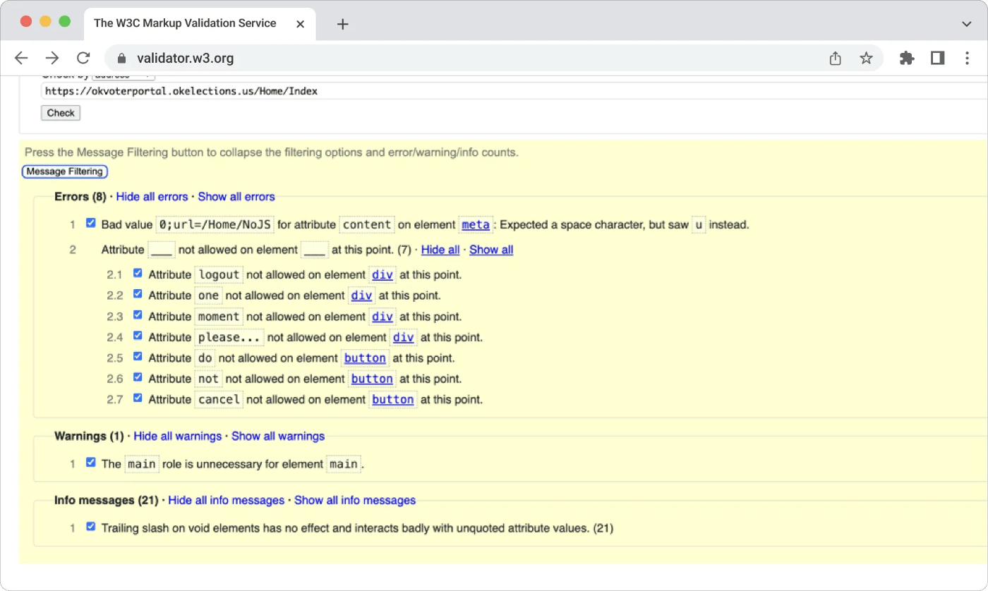
\ Why is it important? Valid HTML markup makes it accessible for assistive technologies, such as screen readers, to interpret and understand the content of a web page. Screen readers are essential for blind and visually impaired users, allowing them to navigate websites through auditory feedback. For example, incorrect attributes can cause screen readers to misinterpret interactive components, like buttons, leading to user confusion.
\ Best practices to avoid HTML code errors include regularly validating HTML using tools like the W3C Markup Validation Service, incorporating linters into your development environment, and implementing automated testing for validation, accessibility, and performance.
2. Missing or Poorly Labeled Input FieldsProper labeling of input fields is another critical aspect of web accessibility, especially for individuals using assistive technologies like screen readers.
\ According to the report, 33 out of 43 websites (77%) have inadequately labeled input fields, making it difficult for users to understand and complete forms. Only 10 websites out of the 43 we tested had no issues labeling input fields. These were Illinois, Kansas, Arizona, Michigan, Minnesota, Nebraska, New York, North Carolina, Ohio, and the District of Columbia.
\
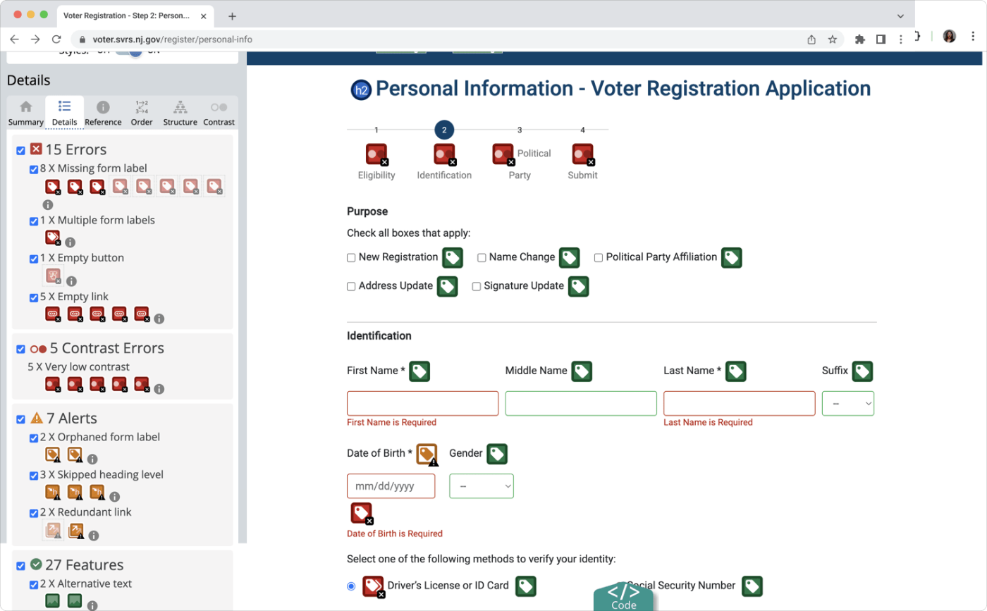
\ For instance, without labels, screen readers might not announce the purpose of form fields correctly, leaving users confused.
\ Best Practices include clearly labeling all form fields with descriptive language and associating them with their elements using HTML tags while providing examples of correct input and identifying mandatory fields with text labels.
3. Low Contrast Between Text and BackgroundColor contrast between text and background is crucial for users with low vision or color blindness. QAwerk's data shows that 23 out of 43 websites (53%) failed to provide sufficient contrast, making it difficult for users to read important information.
\
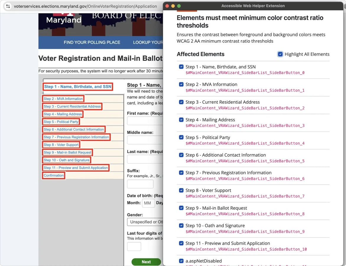
\ WCAG 2.2. guidelines suggest the visual presentation of text and text images has a contrast ratio of at least 4.5:1; large-scale text and images of large-scale text have a contrast ratio of at least 3:1. Improving color contrast is a relatively simple yet impactful fix that developers can implement to significantly enhance the readability of their websites for all users.
\ It can be fixed by following WCAG contrast guidelines, using tools like WebAIM’s Contrast Checker, and ensuring sufficient contrast between text and backgrounds, including when using images.
4. Missing Link PurposeThe "Missing Link Purpose" error is a critical accessibility issue that arises when the purpose of a hyperlink is not clear from its context or the link text itself. When link text is vague or generic (e.g., "click here"), screen reader users may not understand where the link will take them or what action it will perform.
\ 53% of online voter registration sites lack a link description, which can confuse users who rely on screen readers as the destination of the link or action required is not stated. Take the Massachusetts state election site, for example.
\
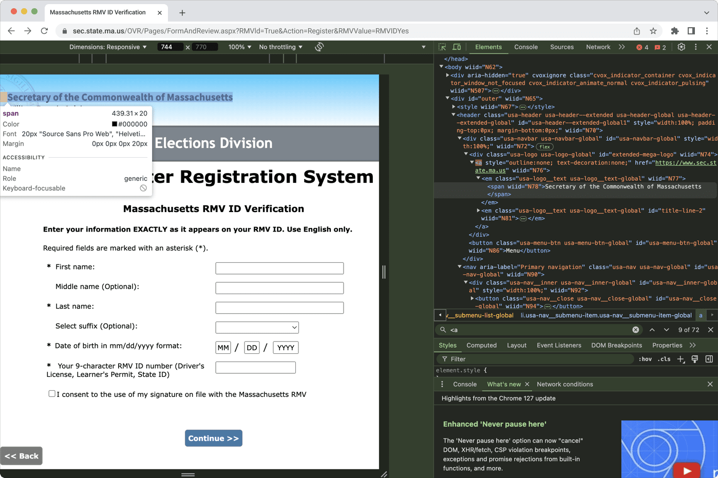
\ Here, the text “Secretary of the Commonwealth of Massachusetts” contains a link, but there’s no description of its destination or action required.
\ Check the purpose of each link is clear from the text or its context, use descriptive link text that makes sense independently, and add a title property for additional clarity when needed.
5. Lack of Clear Error MessagesWhen users make mistakes while filling out online forms, it's essential that error messages are clear, concise, and easy to understand.
Unfortunately, 44% of voter registration sites tested did not provide clear error messages, which can lead to user frustration and prevent them from successfully completing their registration.
\ The Delaware state election site contains this accessibility issue. Here, the user’s error isn’t clearly marked or described. Only the word “Required” indicates that the field is mandatory. The borders of the field are not highlighted in red.
\
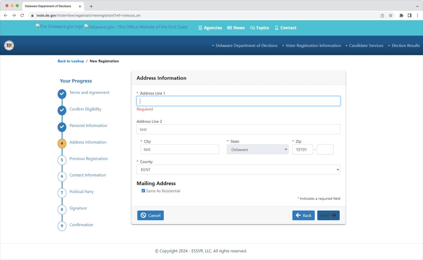
\ Website administrators should check that forms have real-time validation and provide clear guidance when errors happen.
Final ThoughtsCreating a digital environment that guarantees equal access to the voting process for everyone is not only a technical challenge; it’s a fundamental commitment to inclusivity and democracy.
\ Accessibility should be our ongoing effort. Websites must be retested regularly, especially as they get updated and new content is added.
\
- Home
- About Us
- Write For Us / Submit Content
- Advertising And Affiliates
- Feeds And Syndication
- Contact Us
- Login
- Privacy
All Rights Reserved. Copyright , Central Coast Communications, Inc.