and the distribution of digital products.
Specific Details of the Design Process
I chose to share some aspects of my design process, as there is an abundance of fascinating content out there, ranging from general information to specific details. Sometimes, I find it valuable to compare my proсess with others and gain insights from their experiences.
\ This text is a continuation of the previous one, related to the project I am currently working as a solo designer. I recommend that you start by spending 5 minutes reading the first article at the following link to gain more context.
In my previous post, I discussed my experience with using design systems. The design development stage is almost finished now that this phase has been completed successfully, and I have recently begun building a website on Framer. Towards the end of the article I plan to write a couple of lines about working with Framer, but I'll go in order.
\ Notable is a company in the engineering field that focuses on chemical product areas. The company has three distinct product lines: metering pumps, chemical pumps, and chemical reagents. The company has built a strong presence in its industry through over a decade of successful operation in the B2B market. The project's current aims include boosting brand awareness and growing the base of loyal customers. The primary issue stems from the company having three distinct operating divisions, each catering to unique target audiences and requirements. In other words, a user searching for specific information may become confused by irrelevant information, making their experience more complicated. Furthermore, the detailed technical information included in product descriptions can make it challenging to organize the visual hierarchy of content and may result in overwhelming the reader with too much information.
\ This is how the issue was initially explained in the project. However, if you dig deeper, you will need to untangle a complex web of various questions. Gain an understanding of the user including their motives for visiting the site, the situations they are in, the questions they ask, and especially what expectations they have from the business. Conversely, the business aims to operate and grow successfully. In essence, you must strike a balance between assisting the user in navigating their current path more efficiently and aiding the business in generating revenue. Highlighting the main benefits of the service and ironing out any potential issues is essential for this task. Every business has its bottlenecks, but it's not always convenient for your client to discuss them.
\

\ Based on Notable's accumulated experience, the most common ways users find a company's website have been identified:
\ During the design phase of an object, a request is made for a specific technological solution with the involvement of key product components. The user is typically a design engineer with expertise in technology and familiarity with our products. The main benefit for the user is the ease of accessing information and navigation. It is not necessary to provide the full specification, but it is crucial to include specific key elements to ensure the designer fully grasps the requirements.
\ The request has come up because of an unexpected incident at the facility and needs to be resolved quickly. The main focus is on navigation, providing relevant information, and establishing a clear visual hierarchy to simplify the process and guide the user. In this situation, we are not working with a designer, but instead with a manager from the procurement department. And it is probable that his technical expertise concerning the requested product will not be as extensive as it was in the prior situation.
\ The situation occurs when a user is looking for a trustworthy business partner. In this instance, the important values are expertise, reliability, stability and brand awareness.
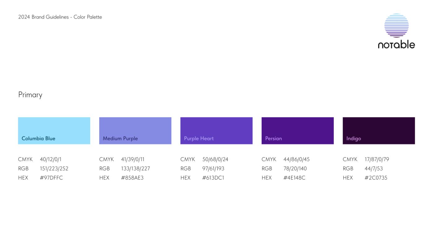
\ Throughout Notable's operational period, the business has also gone through transformation. The previous top sellers have been replaced by other products. There are new solutions that have surfaced. The company naturally aims to differentiate itself in the market by creating a fresh and distinctive brand identity. In analyzing the industry and the branding of companies within similar fields, it became evident that the color balance is heavily skewed towards shades of blue. After a while, we decided to go with this color palette, which mirrors the gradient in the company logo. I believe that this decision allows us to evoke the appropriate emotions. Additionally, the logo's gradient and depth of color highlight the company's accumulated expertise over the years.

\ Returning to the idea of making navigation easier, I thought about using this gradient on the homepage to smoothly move from hero section to the next until reaching the bottom of the page. Our target audiences vary greatly, so the solution needs to be easily understandable for all. The concept is for the user to scroll through the main page to find the relevant section, select a specific color scheme, such as Purple Heart for chemical reagents, and then continue navigating the site horizontally in this Monochromatic color scheme. The user is greeted by the start screen in Columbia Blue, followed by the dosing equipment block in Medium Purple, chemical reagents in Purple Heart, chemical pumps in Persian, and finally, Indigo tones in the footer. Therefore, the main page was designed with an Analogous color scheme to help users easily concentrate on the content they need.
\ I also added horizontal color palettes to each block using color theory and a better sequence for the user. For instance, when browsing the Purple Heart – chemical reagents pages, the user will stay within the color scheme of the corresponding Monochromatic palette.
Website structure.A decision was made to shift from a tree-like structure to a combined, linear one in order to facilitate and accelerate the user's journey. The target pages for the company's top-earning products can now be accessed with just one click. The Bento system made this possible. Cards and an improved visual hierarchy were used to highlight the top products in each Bento block. Therefore, the revised website now consists of just 25 pages, as opposed to the original 61. The achievement was partly a result of the easier-to-use content delivery system and the specific product pages.
\ Therefore, the information architecture on Notable's corporate website now appears as follows:
- homepage;
- Two intermediate pages;
- form page;
- 3 key product pages;
- 2 service pages;
- 16 product pages.
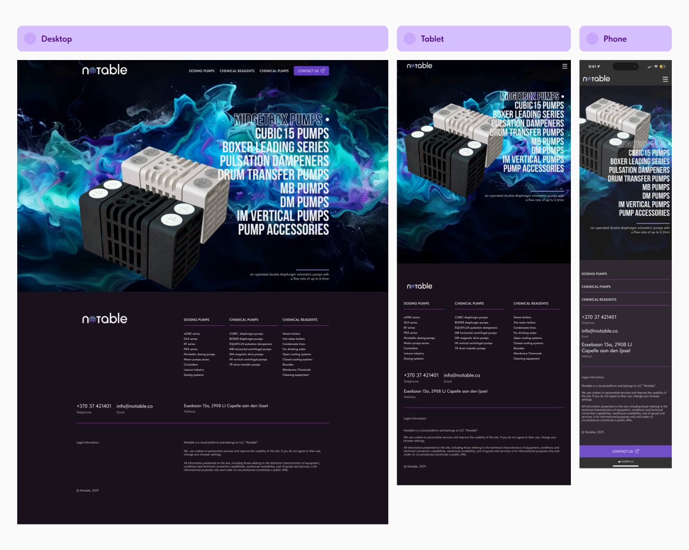
\ Three breakpoints were implemented for the main page, intermediate pages, form pages, key product pages, and service pages to ensure a responsive design: Desktop 1200 px, Tablet 1199-810 px и Phone 809 px.
\

\ On Desktop, the content area is set to 1200 px; I used a simple 12-column grid with a 24 px gutter. The design for Tablet and Phone is completely adaptable. In the end, the design system I developed for this project included:
- 1389 components;
- 288 styles;
- 166 variants.
\ This case is one of those where you don't have enough high quality graphic content. That's just how it turned out. It was necessary to gather everything available, to upscale in some areas, and to attempt to enhance the quality in others. It was challenging to create a large amount of content in Midjourney and other AIs because the neural network is unable to produce technical materials of this quality, this leads to numerous errors and inaccuracies, which quickly and greatly diminish the user's confidence in Notable's expertise. I edited the graphics in Photoshop, incorporated them into a unified color palette, and created the mockups. During my journey, Midjourney has been incredibly useful to me when dealing with abstract graphics representing the movement of liquid. I was fortunate in this instance as I utilized it on the home page start screens, intermediate screens, and the page featuring a key product. The style is consistent, but my main page features a light theme, the product page has a dark theme, and for the intermediate page, as a variation, I animated this abstract flow in Pika.
\ Next I proceeded to construct the website on Framer. Initially, I perceived this stage as a specific challenge due to my lack of experience with Framer. I have experience using different website builders in the past and now have the opportunity to test this one. There is one particular drawback: the expense. Nevertheless, in all other aspects, there are only benefits at this point in time. Usually, one may face several limitations regarding the layout while collaborating with site builders. You have to pursue compromises and depart from the initial design. In the case of Framer, the process involves transferring the layout from Figma with the assistance of plugins, and the use of components is essential. Consequently, this procedure requires a certain amount of time. The animation is generated with minimal effort utilizing only a few mouse clicks. I have a sincere passion for animating layouts in Figma, and I frequently observe a point at which loading speeds noticeably decrease. However, in Framer, any layout is brought to life in a captivating and engaging manner, without requiring a significant time investment. By simply watching a couple of videos from their academy on YouTube, one can quickly gain the skills to enhance dynamic elements.
\ Currently, I will suspend further discussion, and anticipate sharing my impressions following the release in my upcoming post.
- Home
- About Us
- Write For Us / Submit Content
- Advertising And Affiliates
- Feeds And Syndication
- Contact Us
- Login
- Privacy
All Rights Reserved. Copyright , Central Coast Communications, Inc.