and the distribution of digital products.
Machine Learning Visualizations
Visualization is an important part of data exploration for machine learning and data science.
\ There are generally four kinds of visualizations to explore data in machine learning.
\ (1) Relational Visualization
(2) Distributional Visualization
(3) Comparative Visualization
(4) Compositional Visualization
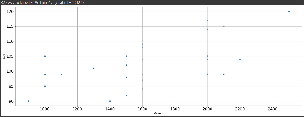
Relational Visualization:Relationship visualization or relational visualization is the visualization that shows the correlation of two or more features in a dataset. In other words, it gives us an understanding of what happens to a variable if a related variable or variables increase or decrease. Does the variable under consideration increase or decrease, and if so, by what measure? The scatter plot is the most common method used to observe this visualization.
\ The Python code to create this scatter plot is given as follows.
\ import matplotlib.pyplot as plt
csvFile.plot(kind = 'scatter', x='Volume', y='CO2', figsize=(20,7), grid=True, fontsize=15)
\ Here, the “csvFile” is the pandas dataframe, and the plot is created using the Python library Matplotlib. \n
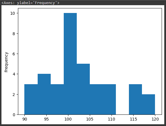
Distribution visualization shows the statistical distribution of data. The Python code to create a histogram that is used for distribution visualization is given as:
\ csvFile['CO2'].plot(kind='hist')
The comparison visualization shows the comparison between continuous features plotted against categorical features. Mostly box charts are used to display comparison visualization. The box chart is also useful to detect outliers that are eliminated to clean the data to improve the accuracy of results. The creation of a box plot is a little tricky compared to the previous two plots.
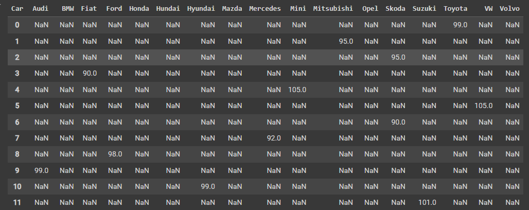
\ A pivot table is created using the y-axis values on the column and the x-axis values in the place of cells.
\ csvFile.pivot(columns='Car', values='CO2')
\
\ csvFile.pivot(columns='Car', values='CO2').plot(kind='box', figsize=(20,7), fontsize=15)
\
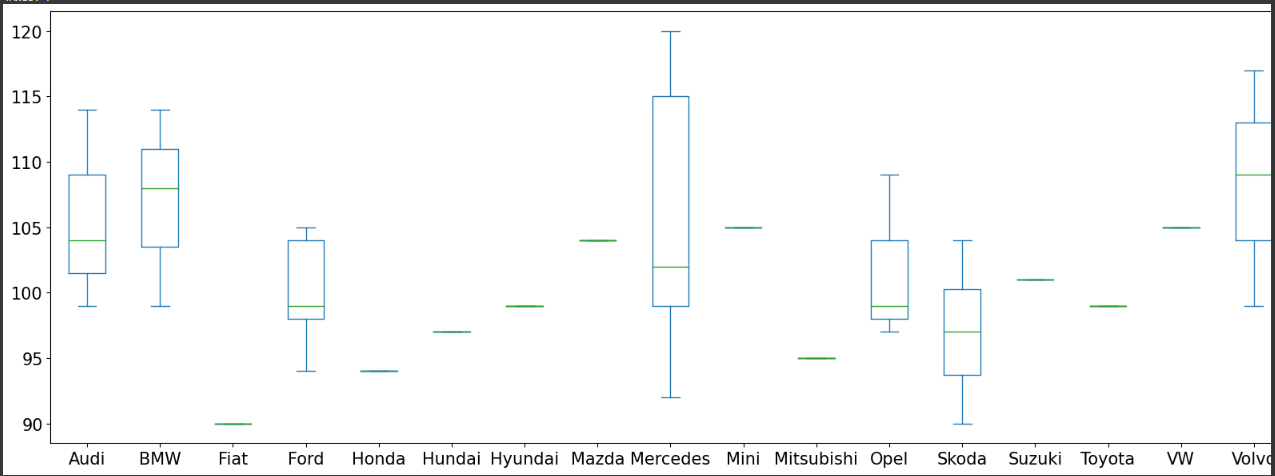
The box plot shows that Mercedez has the highest carbon emission of all the cars.
\
Composition VisualizationComposition visualization shows the component makeup of the data. The composite chart is usually used for compositional visualization.
We begin by creating a pivot table.
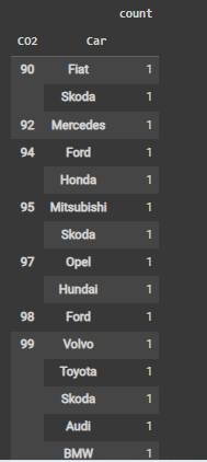
csvFile.groupby('CO2')['Car'].value_counts()
\
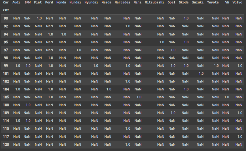
We unstack the pivot table:
csvFile.groupby('CO2')['Car'].value_counts().unstack()
\ csvFile.groupby('CO2')['Car'].value_counts().unstack().plot(kind='bar',stacked=True, figsize=(20,7), fontsize=15)
\
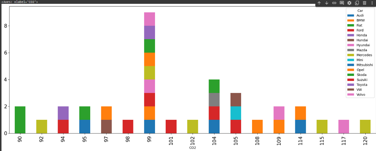
The chart shows that the carbon emission of 99 is the highest number of cars according to the data.