and the distribution of digital products.
Cross-Platform Design Wrapped Part 3: UI Polish and Interaction Design
The human body has existed long before any of what we see around us today was possible and has created intricate systems that drive how we engage with the world, and now, are the point of focus of all IT research, be it biotech or design. These systems direct our experiences in life. Our senses are our compasses, distinguishing the enjoyable from the sickening, comforting from overwhelming.
\ As the flow of incoming signals gets more abundant and more of our lives revolve around digital devices, the role of UI and UX designers has become more important than ever. In this day and age, our senses are working full-time with no breaks, and it’s up to designers to curate experiences that add value rather than detract from them.
\ Fine-tuning the smallest details is what creates the experience we strive for: intuitive, delightful, and streamlined.
But to ensure that every step you take is made in the right direction, you need a deeper understanding not only of the goal you're aiming to achieve, but also the tools and concepts that can get you there.
\ In this part, I’ll explore =="UI Polish and Interaction Design"== — the process of refining and enhancing visual and interactive aspects of a user interface to create all-round delightful experiences. Let’s have a look at the things that will help you build experiences that resonate on a deeper level with your users.
How Apps Are PerceivedThe great thing about UI and UX is that every designer is also a user, and the feeling of enjoying the flow of an interface is great regardless of your occupation. There is no mistaking it! The only difference is, while for users, it stops at delight, for us, the work continues.
\ Let’s start to get more specific. Delight in the UI context refers to the positive emotions a user experiences when interacting with a product, interface, or service — going beyond just fulfilling a functional need. It’s a key aspect of user experience because it makes the experience memorable, driving user satisfaction and loyalty. It makes your app truly special.
\ This is the next level after designing a product’s architecture, the skeleton, — and this step is about adding the muscles, the skin, and making the product come to life.
\
To achieve this, designers need a deep understanding of how people perceive and experience a product. Let’s turn to ==Don Norman’s theory of emotional design==. He explains that users interact with products on three levels: visceral, which is the immediate emotional reaction to how a product looks and feels, behavioral, which covers how well the product works and how enjoyable it is to use, and reflective, which is the long-term connection users develop as they reflect on their experience over time. 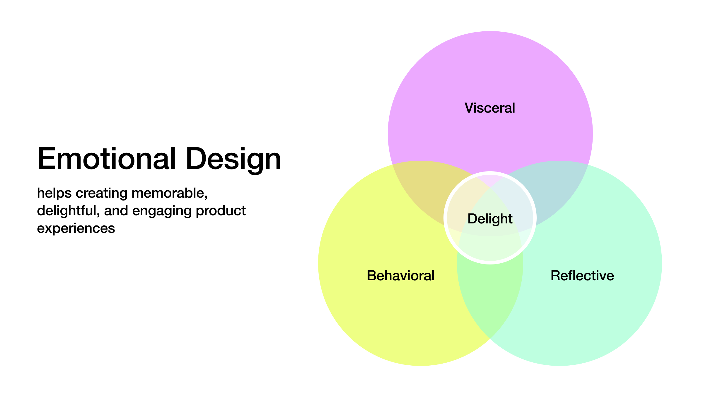
Norman’s theory explains that these levels — ==visceral (first impressions)==, ==behavioral (how it works)==, and ==reflective (long-term emotional impact)== — aren’t linear; they are constantly interacting. A product’s visual appeal (visceral) continues to affect users while they’re engaging with it functionally (behavioral), and every action feeds into how users feel about it over time (reflective).
\ For example, a sleek phone’s interface with smooth navigation will likely induce immediate excitement, but it’s the combination of ease of use and long-term satisfaction that builds lasting loyalty. In design, focusing on how these levels overlap is key to creating a user experience one will remember.
\n This is why delight sits at the intersection of these levels in the framework. It’s not tied to just one aspect of the experience. It’s the synergy between how a product looks, how it works, and how it makes users feel over time that creates an experience worth remembering.
What Makes Apps DelightfulThese aspects of design are deeply tied to the levels of perception, and in the process of polishing the UI, this connection becomes much more obvious. ==Usability== plays a direct role in creating ==behavioral delight== — that feeling users get when everything just works smoothly.
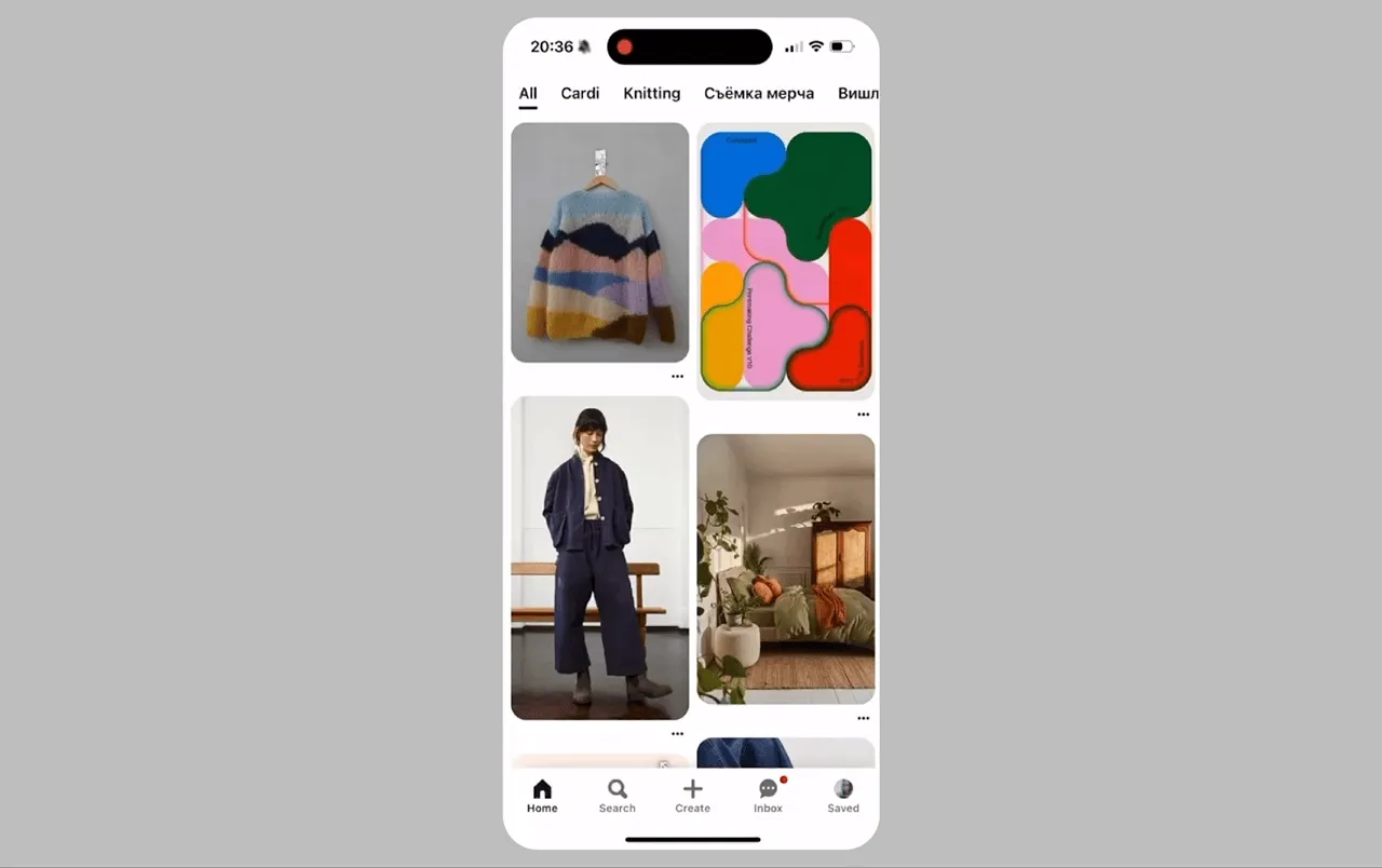
Take, for example, the experience of saving a photo in the Pinterest discovery feed.
\ When a user selects a photo, it enlarges seamlessly, allowing for a detailed view without leaving the feed, instantly enhancing visual engagement. Then, a signature long-press on the photo reveals quick actions like saving the image to a collection or sharing it with others.
\ All essential actions are right at your fingertips, adding a playful touch to the functionality. This design not only simplifies the process of curating personal collections but also enriches overall user satisfaction.
\
 \n On top of that, comes aesthetic appeal and emotion. These add the visceral layer, the immediate, emotional response to the product's look and feel. A clean, well-designed interface with subtle animations or thoughtful color choices invites users in, making them feel at ease right from the start. It’s the “wow” factor that catches attention, but it does more than just look good — it draws users into the experience, reinforcing usability and making interactions enjoyable.
\ In Pinterest’s example, beyond the fundamental usability, the app adds layers of polish that make the experience much more ‘whole’. For instance, when long-pressing a photo and selecting actions like ‘Like’, ‘Save’, or ‘Share’, users might notice subtle haptic feedback.
\ Moreover, Pinterest features certain gestures that many apps use now, such as returning to the discovery feed by swiping down or navigating items by swiping left and right. These details might seem minor, but they contribute significantly to the overall delight and satisfaction of the experience.
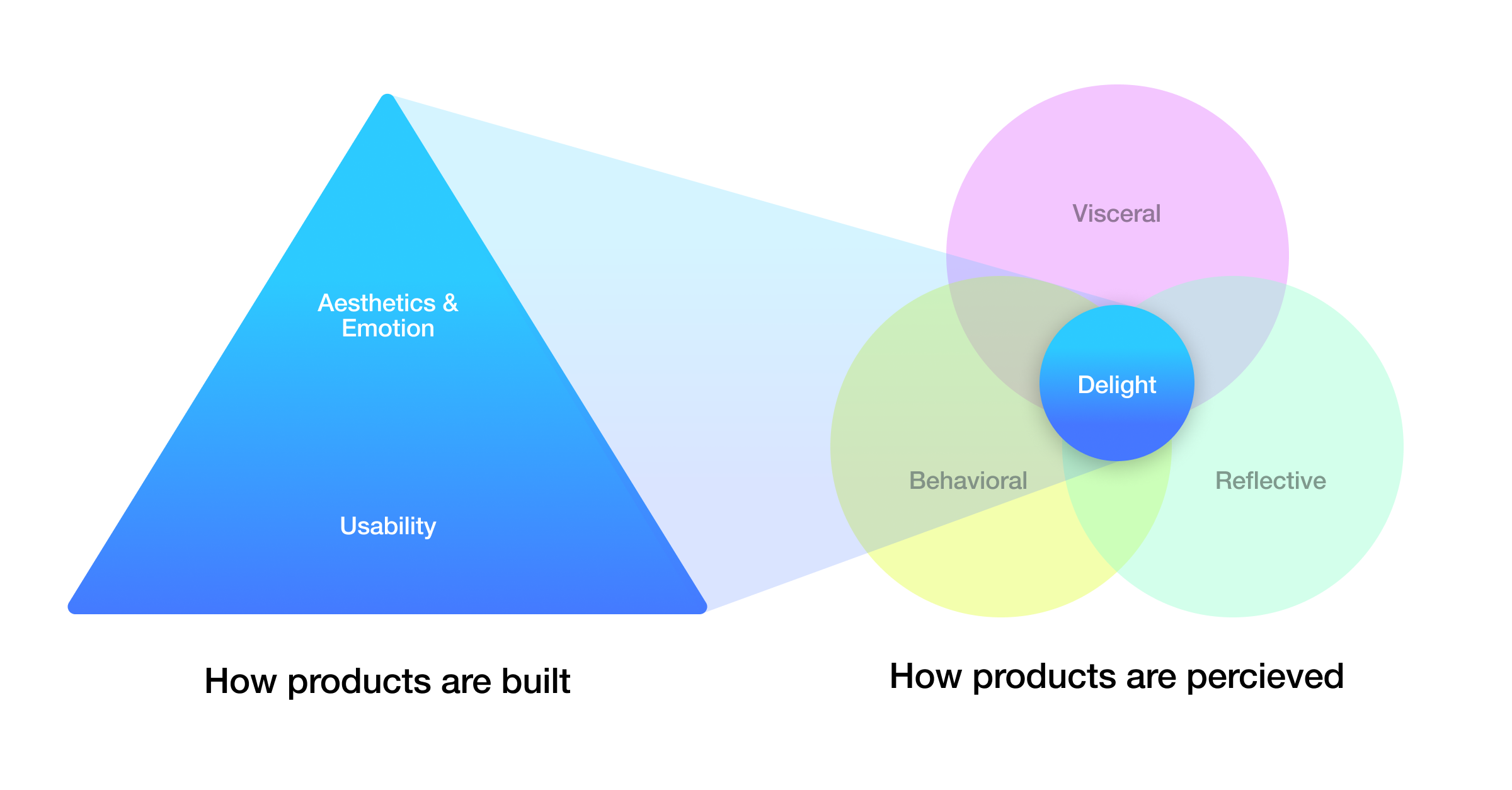
\ But the real magic happens in the middle — when usability and aesthetics work together, creating a unified experience that resonates on multiple levels. That’s when users move from “This works” to “I love this!” It’s not about just delivering the product anymore.
\ Every single element, every pattern implemented, contributes to how your app will be perceived. One interaction, like ordering a service, can touch only the behavioral experience or both behavioral and emotional. Compare the old-fashioned way of ordering a taxi via phone, which often involved waiting on hold, not always pleasant conversations with strangers, and unclear wait times, with the modern, streamlined process in the Uber app.
\ It not only simplifies the ordering process but also enhances the user experience by providing real-time updates on the driver's location, a clear display of fare rates, and smooth transitions between different stages of the ride process. What a shift, huh?
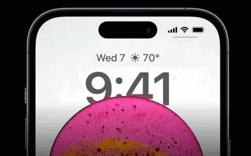
\ However, the division between aesthetics and function in UI is actually more of a formality. Any interface can be delightful, and any 'aesthetic' element can become 'functional'. Take Apple's Dynamic Island — the notorious black notch on earlier iPhones. In later models, it evolved from a mere design necessity to a functional and stylish feature. At first, the notch was a compromise to house the front-facing camera and sensors while maximizing screen space.
\ Then, over time, Apple transformed it into a crucial part of the Face ID technology, offering a fast and secure authentication method that users quickly embraced.
\
Here are a few examples of how pure ‘utilitarian’ elements can be elevated with touches of delight:
\
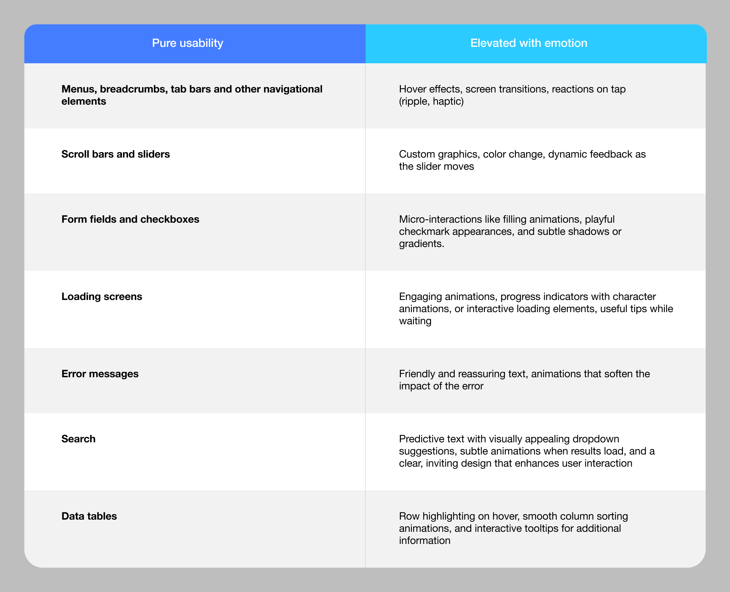
\ The true skill of a designer in crafting delightful apps lies in understanding ==when, how, and why== to infuse emotional elements. This hinges on the use case, context, and approach — the three foundational pillars guiding every design decision. It's about discerning when to prioritize usability, when to introduce emotional layers, and when to seamlessly integrate both to create experiences that deeply connect with users.
\ Let's face it, even the most delightful animation can become a source of frustration if you're anxiously watching it while a $1000 payment fails to process.
Example 1. iMessage Keywords AnimationWhen you send certain keywords like "Congratulations" or "Happy Birthday" in iMessage, the text triggers a full-screen animation, such as balloons or confetti, adding a fun and engaging visual celebration to the message.
\

\
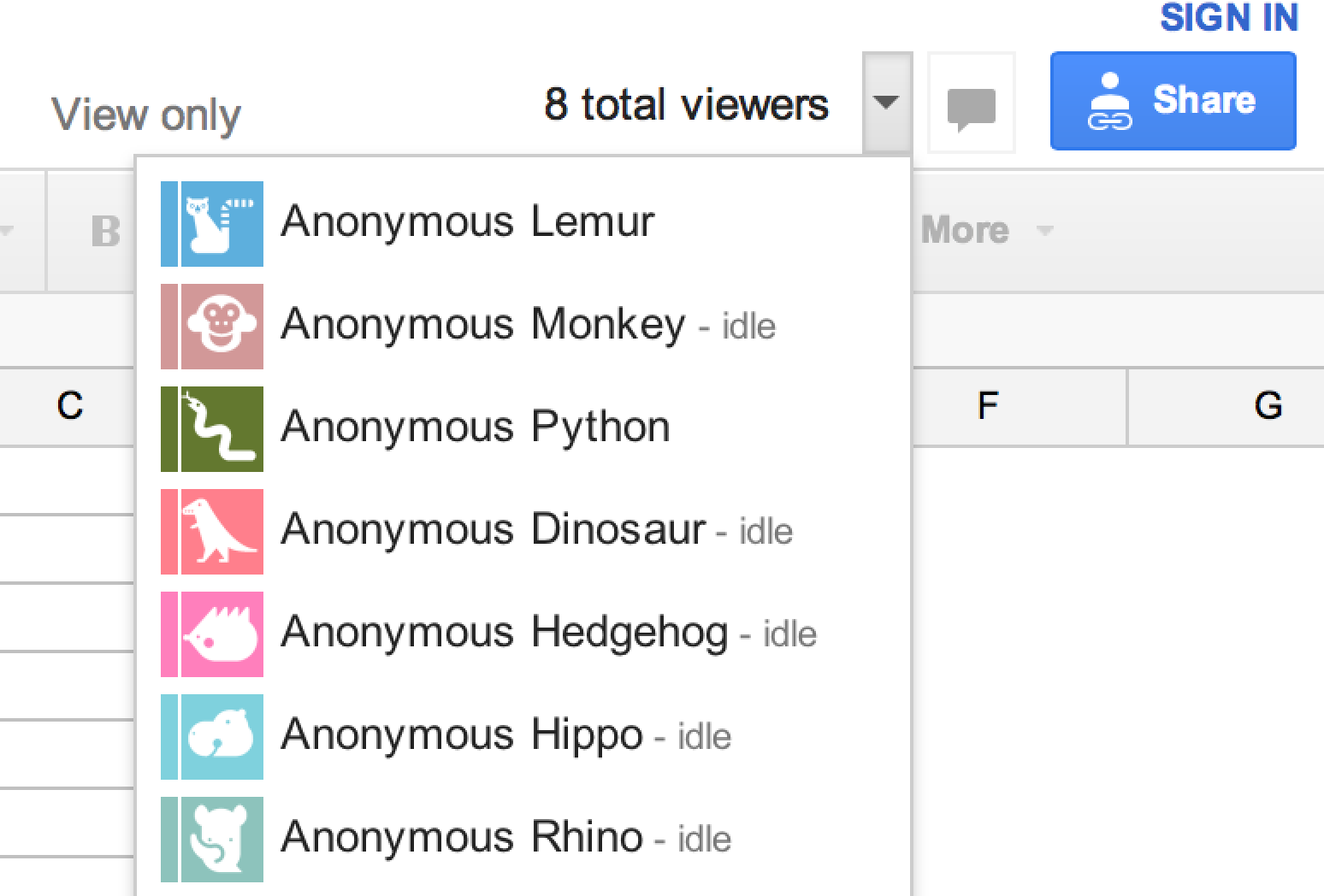
Example 2. Branded Profile Pics in Google Docs/SheetsGoogle Docs and Sheets display colorful, branded profile pictures that show who is editing the document in real-time. This not only makes collaboration more personal but also helps users quickly identify their co-editors.
\
\ \
Example 3. iOS Memoji Following the Password Input FieldWhen inputting a password on an iOS device, a Memoji character springs to life within the password field, mirroring your facial expressions. If you enter it incorrectly, it may frown or shrug its shoulders in response. If there's a delay in typing, the Memoji might even yawn, adding a whimsical touch to this very mundane task. It infuses a bit of personality and humor into your everyday routine.
 Example 4. Google Dinosaur When the Internet Is Off
Google Chrome features a hidden dinosaur game that appears when there is no internet connection. It’s a simple, addictive game, but most importantly – a great way to turn momentary frustration into a bit of fun.
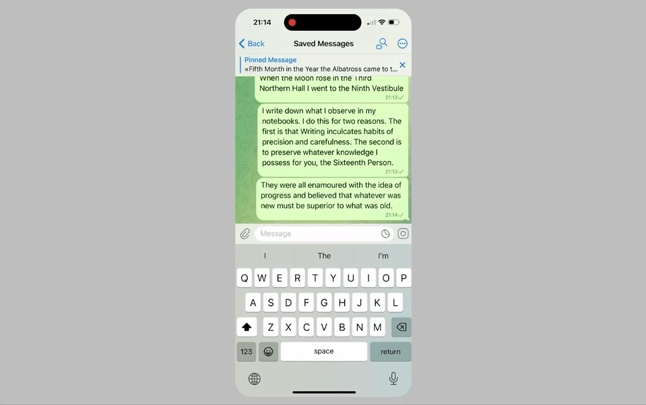
Example 5. Telegram Deleting a MessageIn Telegram, when you delete a message, it disappears with a neat animation that visually shreds the message like paper before it vanishes, giving users a sense of control over their intangible digital conversations.
\
\
Don’t Make Me Think: Design Patterns and ComponentsThe heart of a polished UI is patterns and components. ==Design patterns== are established solutions to common interface challenges. They provide a familiar structure for users to interact with. These, in turn, consist of components — the building blocks of the interface, such as buttons, input fields, and modals.
\ Together, patterns and components create a seamless user experience where users intuitively understand how to navigate the app.
\ To elevate functional elements (such as menus, forms, or buttons), we can enhance them with aesthetic and emotional techniques. You can add subtle animations, engage micro-interactions, and thoughtful use of color and typography, going beyond just function. All of this becomes your design system – a collection of reusable components and patterns guided by clear rules, ensuring consistency across the app.
\ Predefined animations, color schemes, and interaction patterns all evoke specific emotions, so the design system becomes a powerful tool for creating cohesive and engaging interfaces. This approach allows designers to consistently apply these enhancements without starting from scratch, reinforcing the brand's identity and building user trust.
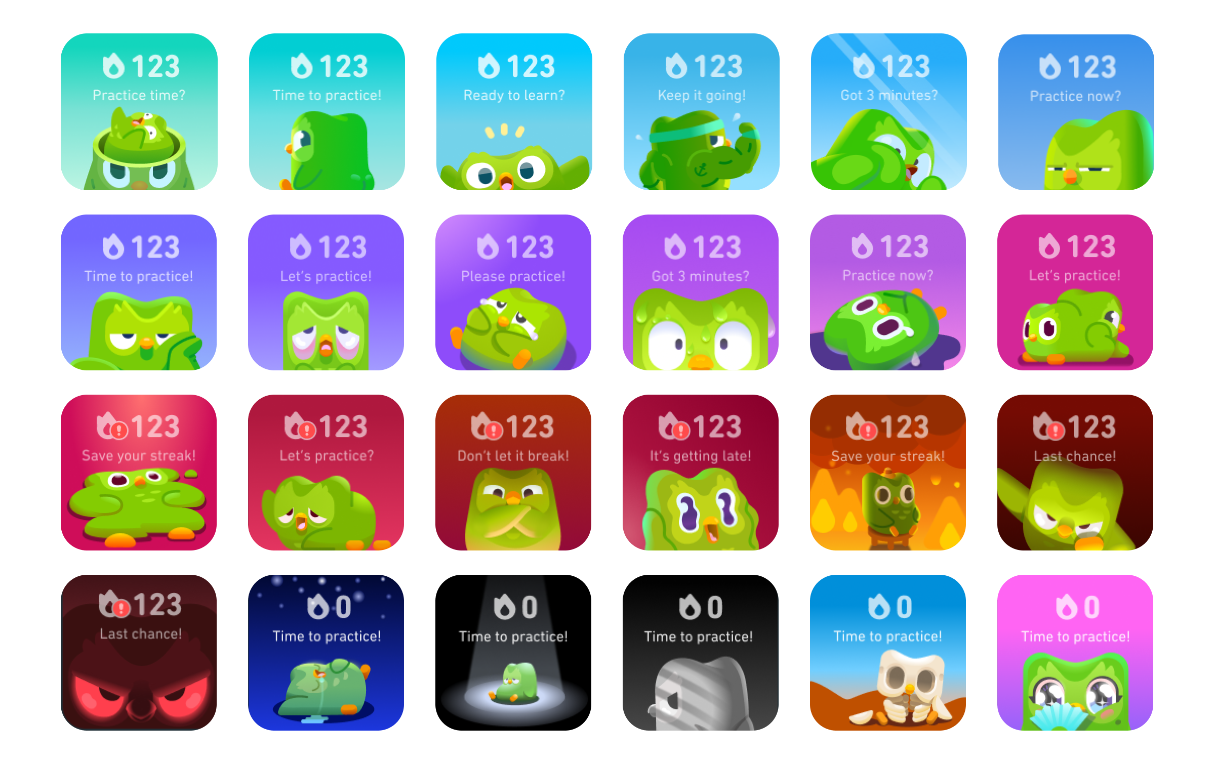
Example 1. Duolingo's Playful WidgetIn Duolingo, when you answer a question incorrectly, the app doesn't just display a plain error message. Instead, it responds with a friendly animation and encouraging words from its mascot, Duo the Owl. This approach turns a potential moment of frustration into a positive learning experience, keeping users motivated and reducing negative emotions associated with making mistakes. Real-world tactics, but animated.
\
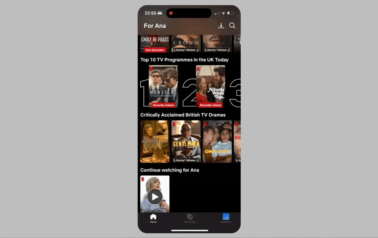
 Example 2. Netflix’s Card Animation
Netflix's show card animation exemplifies seamless UI design, enhancing user engagement across devices. When a user selects a show, the card expands into a full-screen trailer, providing a cinematic preview that captures attention. This smooth transition, which adds a touch of delight, is consistent, including on their TV app, where the same animation leads to an auto-playing trailer.
\ This unified approach across platforms ensures a cohesive user experience, reducing cognitive load and simplifying navigation.
\
\
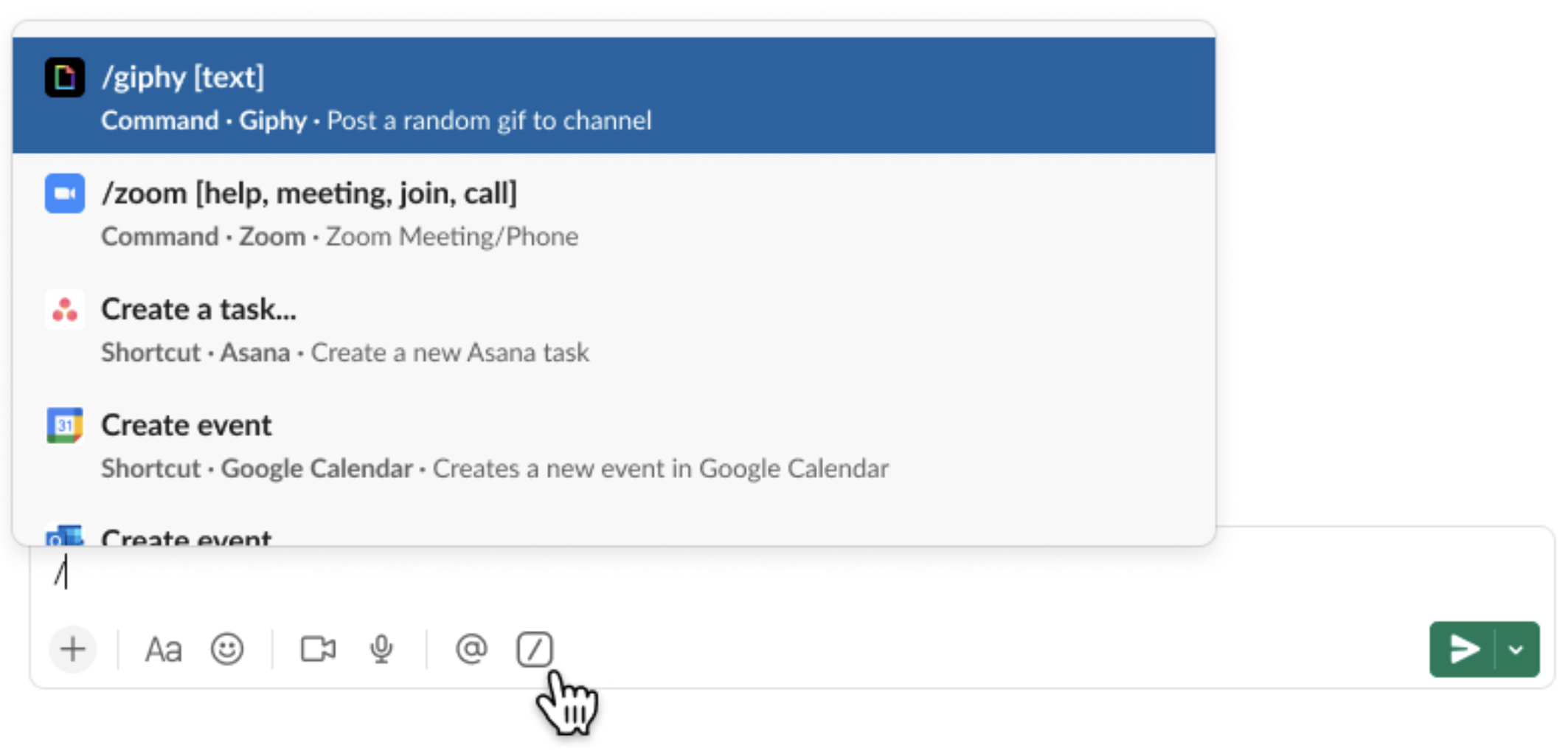
Example 3. Slack's Quick CommandsDelight and emotional engagement can also stem from product features, not just UI design. Slack's Quick Commands exemplify this by enhancing productivity and streamlining interactions within the app. Designed with a focus on productivity, Quick Commands allows users to save significant time by simply typing the needed command. For example, users can update their status with /status or silence notifications with /mute directly in the message input box.
\ This not only accelerates workflow but also minimizes interruptions, allowing users to concentrate on their tasks. The intuitive and time-saving nature of Quick Commands is precisely why users love them so much. My personal favorite is /shrug, which appends ¯\(ツ)/¯ to the end of your message, and it’s so much fun!
 The Role of Interaction Design
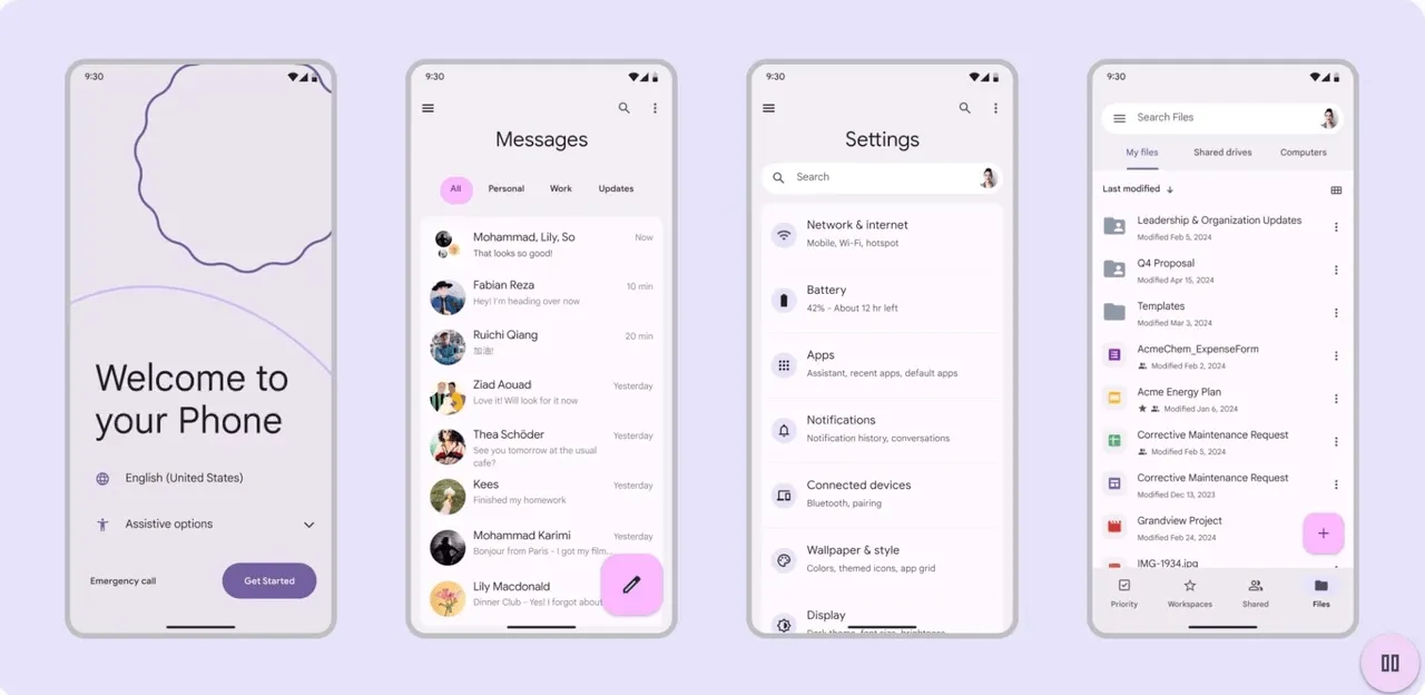
\ While ==design patterns== and ==components== are the building blocks of a polished UI, ==interaction design== brings everything to life. Interaction design is about how users engage with those components — how they click, tap, swipe, and navigate through the app.
\ For example, a menu is a common navigational UI element, but it’s the interaction design that determines how it feels. Does the menu slide in smoothly? Does it respond instantly to a swipe gesture? Haptic touch upon completion? Does it have subtle animations that make the transition pleasant?
\ A great example of effective interaction design is the ‘==Genie’ effect in macOS==, used for minimizing Finder windows. This animation smoothly transitions the window into the dock, resembling a genie's lamp motion. It's visually appealing and functionally informative and shows users exactly where the window goes, which helps maintain spatial orientation.
\ Interaction design and the design system work in harmony. In interaction design, consistent behaviors for all components, such as how buttons respond when clicked or how forms validate input, ensure that the app behaves predictably across every screen. This consistency is what builds user confidence — meaning users feel comfortable knowing how the app will respond, which reduces friction and enhances the overall experience.
\ When interaction design is done right, it works alongside patterns and components to create a cohesive experience where every tap, click, and swipe feels intuitive. This is something that truly brings interfaces to life.
\
In my other articles, I’ve emphasized the importance of building a team with your developers. Designers have to collaborate with developers because thanks to them these animations and interactions actually can be and are implemented effectively. Providing the team with detailed, clear specifications for animations — including timing, easing, and behavior — is key. This way the intended design vision is accurately translated into the final product, making it polished, professional, and emotionally resonant for the user.
\
Going Above the OrdinaryEnjoyment in life goes far beyond doing the technical actions that can lead you there. It’s a sum of the tiniest details that create a whole, fulfilling experience. Design is the same. A functional interface is a robust foundation – but it’s bland. Understanding how users see and use your app helps create experiences that are easy to use and meaningful. I think Don Norman’s emotional design theory is a great guide to the intricate connections between all aspects that make good design – delightful.
\ Emotional connection, design patterns, consistency, and interaction design are the things that make it come alive. Plus, it is a powerful reminder that in product design, the journey matters just as much as the destination. Through subtle animations, engaging micro-interactions, and thoughtful visual details you can turn routine interactions into enjoyable moments for millions of users. That is the magic of design. \n
- Home
- About Us
- Write For Us / Submit Content
- Advertising And Affiliates
- Feeds And Syndication
- Contact Us
- Login
- Privacy
All Rights Reserved. Copyright , Central Coast Communications, Inc.