and the distribution of digital products.
DM Television
Building a high-converting multi-step form: Best practices and tools

Try to gather as much information as possible about your customers to use it for personalization. While some companies only ask for two fields—name and email—in registration or subscription forms, others require much more. Large forms can discourage users, but breaking them into multiple steps can make them appear simpler and easier to fill out. In this article, we’ll discuss how to make a multi-step form effective.
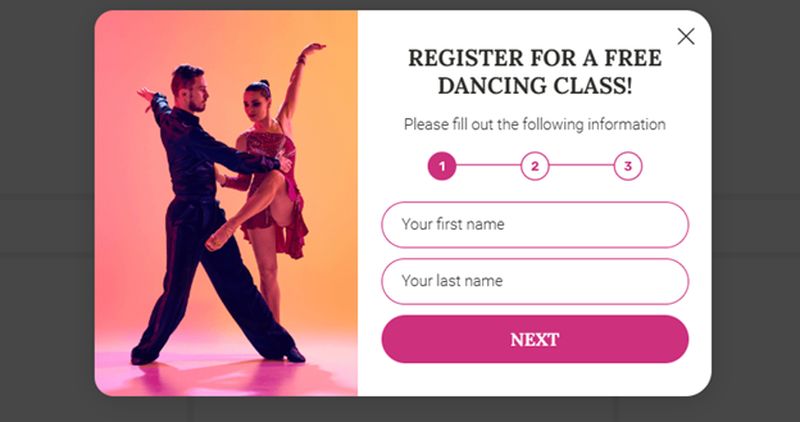
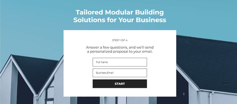
What are multi-step forms and why they workA standard subscription form consists of a single window with fields to fill out and a confirmation button. A multi-step form, on the other hand, has several windows that open one after another. It can be set up so users can navigate back and forth or move only forward after completing the required fields.
Multi-step forms are useful for managing complex tasks like registrations, bookings, surveys, and detailed data submissions. They show a 86% better conversion rate than regular forms. Here’s why they’re a smart choice for businesses to streamline user interactions and gather actionable insights:
- Improved User Engagement: Segmenting forms into digestible steps reduces cognitive overload, encouraging users to stay engaged through completion.
- Streamlined Usability: Progress indicators offer a clear visual guide, helping users understand how much of the process remains, which fosters a smoother journey.
- Higher Completion Rates: Simplifying navigation and breaking down lengthy forms makes users more likely to complete the task without feeling overwhelmed.
- Contextual Relevance with Conditional Logic: Multi-step forms dynamically adjust based on user responses, ensuring each interaction is tailored and efficient.
- Enhanced Conversion Opportunities: By minimizing friction and delivering a seamless experience, multi-step forms drive higher submission rates, ultimately supporting data collection and lead generation efforts.
While single-step forms have their place, multi-step forms are particularly effective for tasks requiring more detailed data collection. Here’s where they shine:
- Signup forms
 Take a newsletter signup process, for instance. A multi-step registration form can achieve two goals simultaneously: streamline the user experience and gather additional data to craft newsletters tailored to your audience’s preferences.
 - Lead generation forms
 Multi-step forms are great for capturing detailed information about potential customers without overwhelming them. Based on this data businesses can segment leads more effectively and identify those most likely to convert into loyal customers.
 - Surveys and feedback forms
 The number of questions in a survey or feedback form can vary, but research indicates that 5 to 15 questions often strike the right balance for actionable insights. Splitting these questions into logical steps makes the process less daunting, encouraging higher completion rates and richer data collection.
 - Pre-order forms
 When collecting pre-orders, a multi-step form offers a structured and error-resistant approach. By allowing users to validate their entries at each step, these forms reduce errors and ensure all critical fields are completed, delivering a smoother experience for both the user and the business.
A successful multi-step form relies on effective progress tracking. Users appreciate knowing how far they’ve come and how much remains. Tools like progress bars or step indicators at the top of the form are excellent for providing this clarity.
In some form builders progress indicators are included by default and can be customized to suit your needs. For instance, instead of a standard progress bar, you can incorporate checkpoint pages that display milestones, helping users feel accomplished at each stage.
2. Assign one task per stepBreaking down forms into logical steps ensures users remain focused. Group related fields into separate sections—for example, one step for personal details, another for contact information, and so on.
Each section should serve a clear purpose, with concise steps containing no more than five to seven fields. Adding headers to label each step can further enhance clarity and streamline the user experience.
3. Provide hints and instructionsAdding context and instructions makes forms easier to understand and complete. Brief explanations at the start of each step can help users understand why specific information is needed and how to fill in the fields accurately.
For example, when requesting an address, include a note like: “Provide the address where you’d like your items delivered.” Simple yet informative guidance like this encourages users to stay engaged and prevents confusion.
4. Design effective confirmation and error screensThe final impression your form leaves is just as important as the first. A well-crafted confirmation screen reassures users that their submission was successful. Use friendly language, visual cues like a green checkmark, and CTAs such as “View Your Account” or “Return to Homepage” to guide users seamlessly.
Error screens should be equally thoughtful. Provide specific feedback on what went wrong and actionable steps to correct it. A supportive tone, combined with options like a “Retry” button or troubleshooting suggestions, can reduce frustration and maintain trust.
5. Prioritize mobile usabilityGiven the prevalence of mobile users, making your multi-step forms mobile-friendly is essential. Ensure form fields and buttons are large enough to tap easily, and use vertical stacking to eliminate horizontal scrolling.
To optimize space further, disable unnecessary elements like large images or videos. These adjustments improve accessibility and create a smoother experience for users on smaller screens.
By incorporating these practices into your multi-step forms, you’ll create a user-friendly experience that drives better engagement and higher completion rates.
Featured image credit: Glenn Carstens-Peters/Unsplash
- Home
- About Us
- Write For Us / Submit Content
- Advertising And Affiliates
- Feeds And Syndication
- Contact Us
- Login
- Privacy
All Rights Reserved. Copyright 2025, Central Coast Communications, Inc.