and the distribution of digital products.
Unleash the Power of Interactive Data: Python & Plotly
\
"The greatest value of a picture is when it forces us to notice what we never expected to see."
\ - John W. Tukey
\ Data visualization transcends the mere presentation of information; it transforms raw data into compelling narratives that unveil hidden patterns and unexpected insights. By translating complex data into visual representations, we empower ourselves to understand and interpret information more effectively. Visualizations act as powerful tools for exploration and discovery, allowing us to identify trends, make informed decisions, and communicate complex concepts with clarity and impact. As Tukey eloquently stated, the true power of visualization lies in its ability to reveal the unexpected, forcing us to question our assumptions and broaden our understanding of the world around us.
\ In this article, we will explore Plotly, a powerful Python library that empowers us to create interactive and visually stunning visualizations, unlocking the true potential of data and revealing insights that might otherwise remain hidden.
What is plotlyPlotly is a powerful Python library for creating interactive and visually appealing data visualizations. Some of its features include:
\
- Interactive Charts: Zoom, pan, hover for details, and filter data within the charts themselves.
- Diverse Chart Types: Supports a wide range of charts, from simple line plots to 3D graphs and maps.
- Customization: Easily customize colors, labels, and layouts to tailor visualizations to your needs.
\ Plotly enables you to explore data more deeply, communicate insights effectively, and create engaging presentations.
Lets build an interactive chart using plotly Step 1: Installing PlotlyFirst, you’ll need to install Plotly. You can do this using pip:
pip install plotly\ For this exercise, we’ll use the Plotly Express module, which simplifies plot creation
import plotly.express as px Step 2: Importing DataLet’s use the gapminder dataset, a popular dataset for visualizing country-level data over time. Install the dataset with:
pip install gapminder\ Now load the data:
from gapminder import gapminder data = gapminder.copy() Step 3: Creating a Scatter PlotLets build a simple scatter plot using plotly:
\
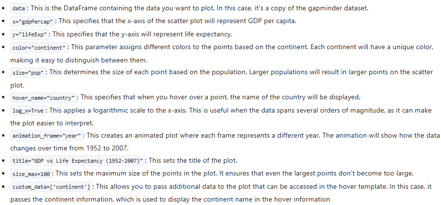
fig = px.scatter( data, x="gdpPercap", y="lifeExp", color="continent", size="pop", hover_name="country", log_x=True, animation_frame="year", title="GDP vs Life Expectancy (1952-2007)", size_max=100, custom_data=['continent'] )\ Explanation of parameters:
\

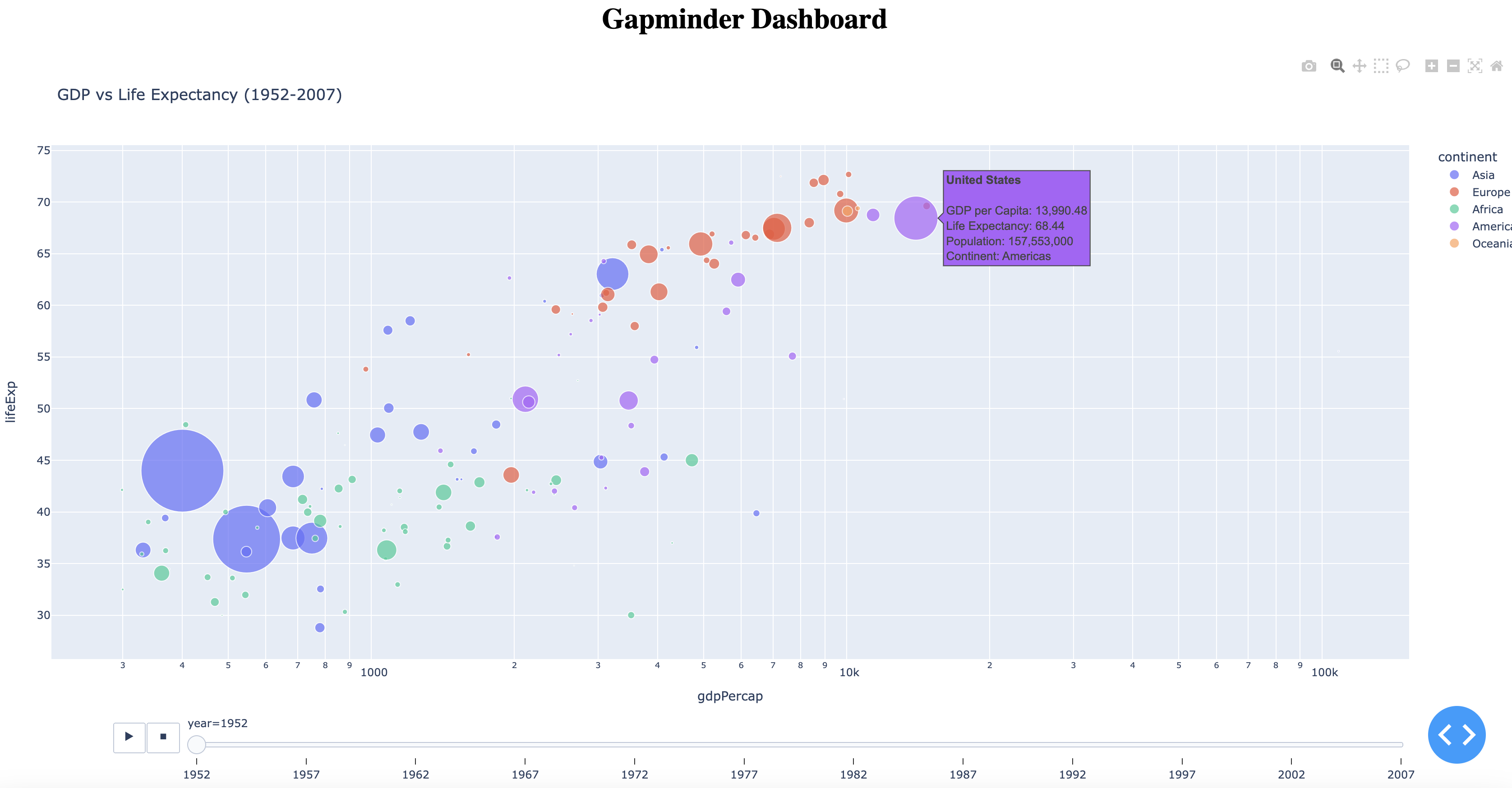
\ This scatter plot visualizes the relationship between GDP per capita and life expectancy across different countries and continents over time. The animation feature allows you to see how these metrics evolve from 1952 to 2007. The use of color, size, and hover information enhances the plot's interactivity and readability, making it a powerful tool for exploring the data
Step 4: Formatting and customizing hover informationTo enhance the user experience, customize the information displayed when hovering over data points. Utilize hovertemplate to create informative hover messages with controlled formatting, including HTML-like tags for improved readability.
\
fig.update_traces( hovertemplate=( '%{hovertext}' 'GDP per Capita: %{x:.2f}
' 'Life Expectancy: %{y}
' 'Population: %{marker.size:,}
' 'Continent: %{customdata[0]}
\ hovertemplate is a string that defines what information appears when hovering over a data point. %{hovertext} displays the country name, %{x:,.2f} formats GDP per capita to two decimal places, %{y} shows life expectancy, and %{marker.size:,} formats the population with commas for readability. %{customdata[0]} displays the continent name, which was passed as custom_data.
Step 5: Building a DashboardDash is a Python framework for creating interactive web applications, ideal for data visualization. It integrates with Plotly for dynamic charts, requiring no front-end expertise. Its component-based design and reactive updates simplify building responsive dashboards, making it a favorite among data scientists for sharing insights effectively.
\
from dash import Dash, dcc, html app = Dash(__name__) app.layout = html.Div([ html.H1("Gapminder Dashboard", style={"textAlign": "center"}), dcc.Graph( figure=fig, style={"height": "100vh", "width": "100vw"} ) ], style={"margin": 0, "padding": 0}) if __name__ == "__main__": app.run_server(debug=True)\ Visit http://127.0.0.1:8050/ in your browser to see your interactive, fullscreen dashboard.
Putting it all together from gapminder import gapminder import plotly.express as px from dash import Dash, dcc, html def create_gapminder_dashboard(): # Copy the gapminder data data = gapminder.copy() # Create the scatter plot figure fig = px.scatter( data, x="gdpPercap", y="lifeExp", color="continent", size="pop", hover_name="country", log_x=True, animation_frame="year", title="GDP vs Life Expectancy (1952-2007)", size_max=100, custom_data=['continent'] # Pass continent data for custom hover ) # Customize the hover template to format population with commas fig.update_traces( hovertemplate=( '%{hovertext}' 'GDP per Capita: %{x:,.2f}
' 'Life Expectancy: %{y}
' 'Population: %{marker.size:,}
' 'Continent: %{customdata[0]}
\ Output:


Congratulations! You've embarked on a journey with Python and Plotly, mastering the art of interactive data visualization. You've learned to transform raw data into captivating and insightful visuals, effectively communicating your findings to any audience. By combining Plotly's interactive capabilities with the flexibility of Python and the power of Dash, you can now create dynamic dashboards that empower users to explore data in new and exciting ways. These skills will not only enhance your data analysis capabilities but also make you a more effective communicator in our increasingly data-driven world. Continue to explore the vast possibilities of Plotly and unlock even greater insights from your data.
- Home
- About Us
- Write For Us / Submit Content
- Advertising And Affiliates
- Feeds And Syndication
- Contact Us
- Login
- Privacy
All Rights Reserved. Copyright , Central Coast Communications, Inc.