and the distribution of digital products.
This One Simple Change Makes Your Website More Accessible
Today I want to remind about important topic - Accessibility. It's a community-driven effort to make digital accessibility easier.
Small part of this topic is typography. The text should look good with any browser font-size.
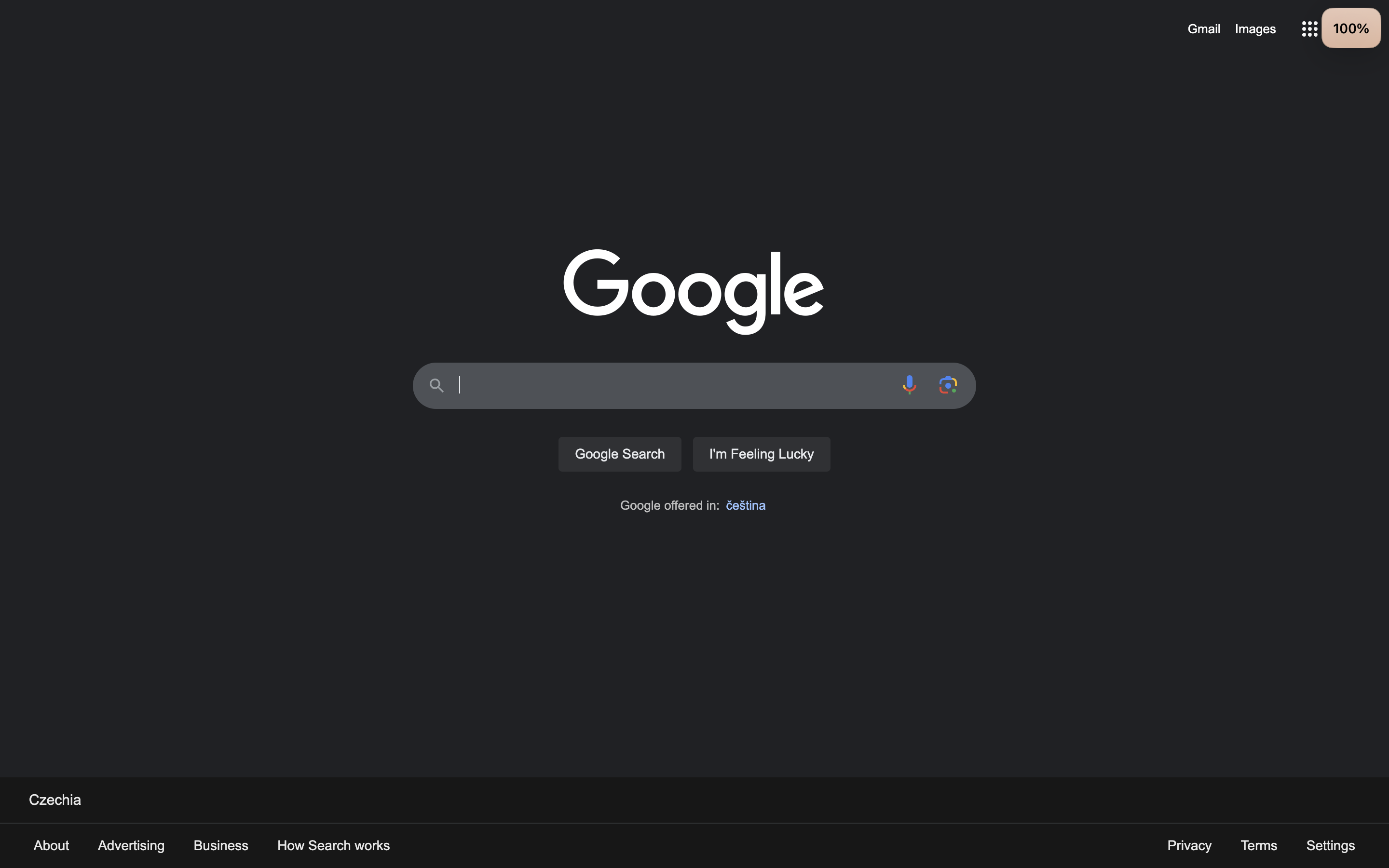
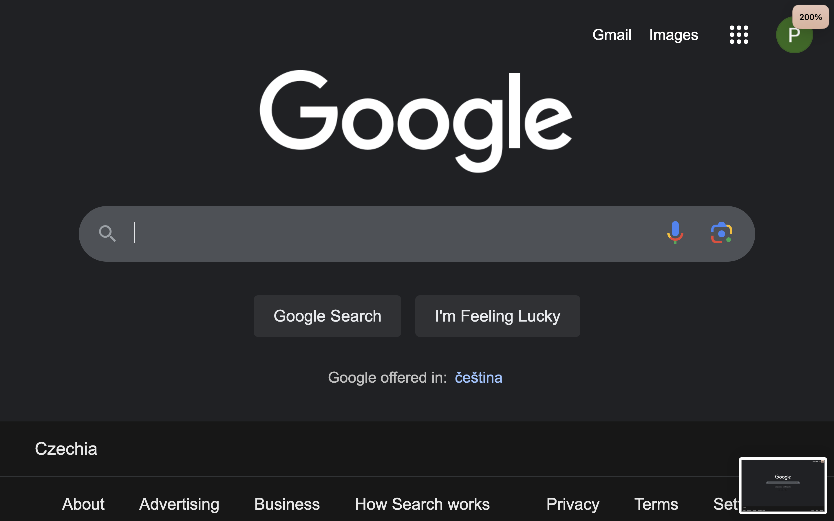
| 100% | 200% |
|----|----|
| 
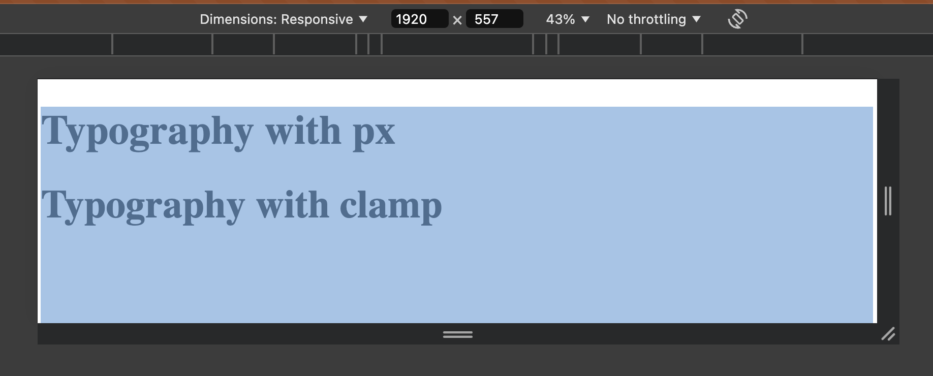
I know, we all did that, a lot of people on the internet use it in their courses. But it is a bad approach. Here is one simple rule if you are not sure which unit to choose:
px - fixed-size elements that won't change, such as for borders or shadows.
rem - font sizes to make it accessible to users who have changed their browser's default font size.
vw / vh - elements sizing sticking with viewport size
% - elements sizing sticking with relative size
How to make accessible fluid textAll we need is clamp() to make it accessible and formula to make it responsive.
- Make sure you set global font-size to 16px. And line-height at least 1.2
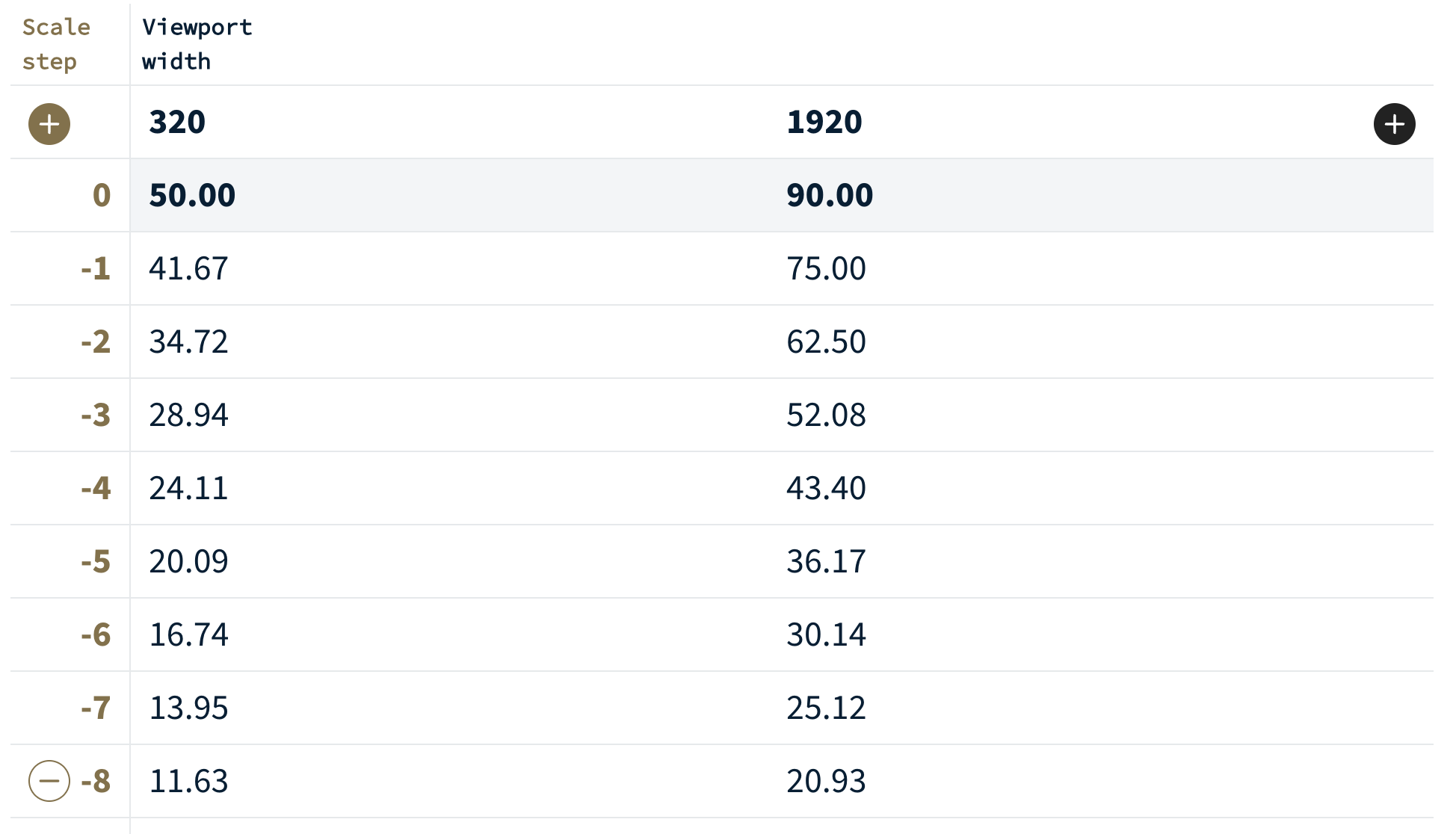
Define your minimum and maximum screen size, 320 px - 1920 px in my case.
Define size of your text you want to have at your minimum and maximum screen. In my example I have h1 tag so my font-size will be 50px and 90px accordingly.
Go to https://utopia.fyi/type/calculator and put your values there
Scroll down to CSS Generator. We need --step-0 value
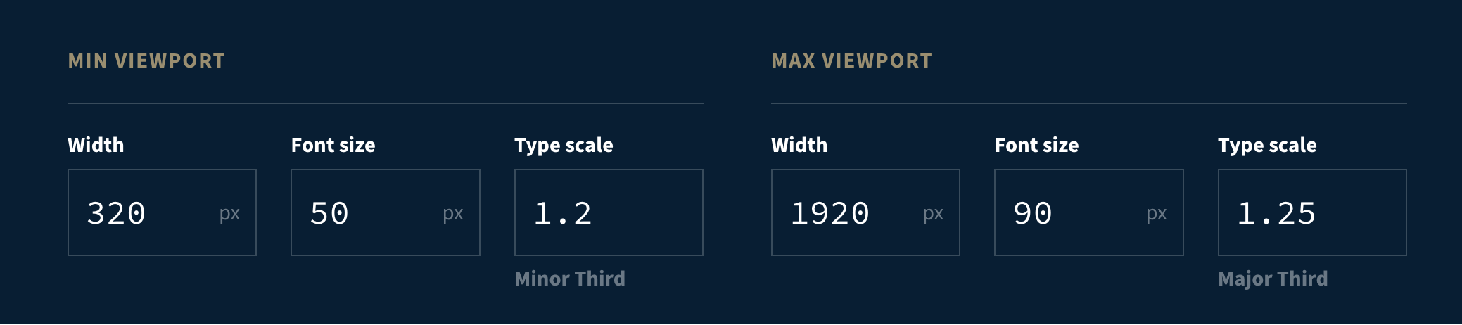
- Put clamp(3.125rem, 2.625rem + 2.5vw, 5.625rem); as font-size of your text.
Result :
| 320px | 1920px | 1920px(200% zoom) |
|----|----|----|
| 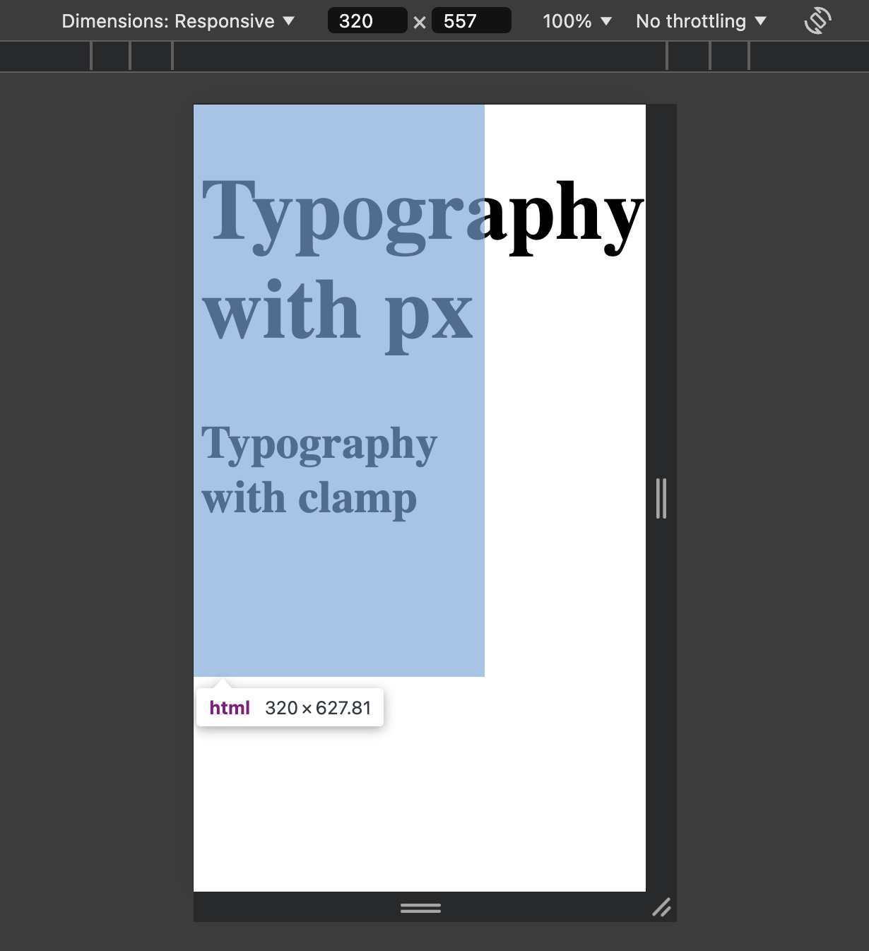
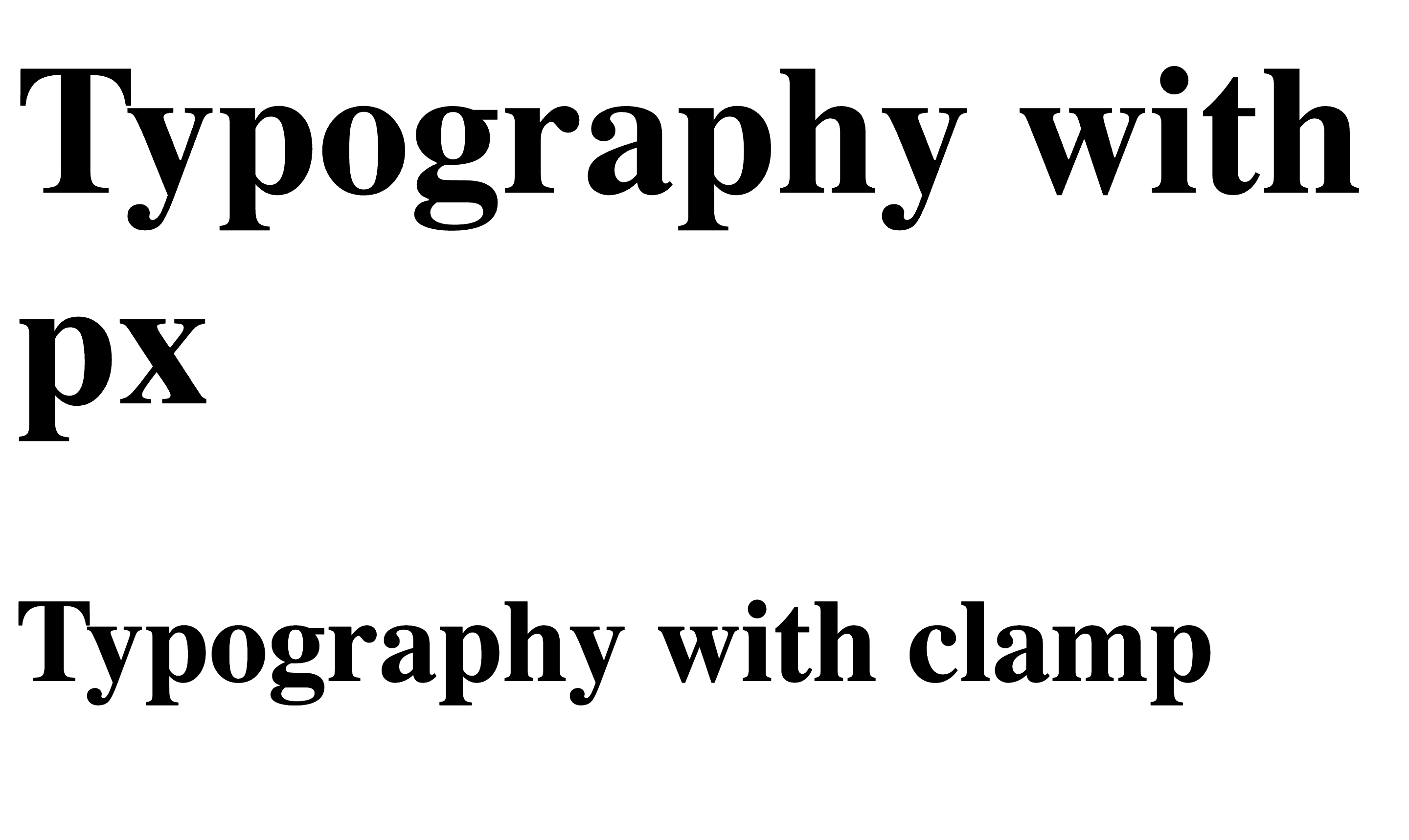
You can see that with 1 line of css my text is responsive and accessible for browser scaling as well.
Typography components in 10 minutesMy intention was to create flexible Typography component as fast and as flexible as possible.
I took my largest h1 text. Went to https://utopia.fyi/type/calculator and generated 8 downscale steps:
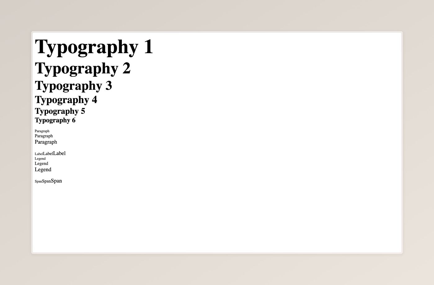
This would be my p, h1-6, span and label text sizes
--size-text-s: clamp(0.7268rem, 0.6834rem + 0.2169vw, 0.9437rem); --size-text-m: clamp(0.8721rem, 0.8106rem + 0.3075vw, 1.1796rem); --size-text-l: clamp(1.0466rem, 0.961rem + 0.428vw, 1.4746rem); --size-h6: clamp(1.2559rem, 1.1384rem + 0.5873vw, 1.8432rem); --size-h5: clamp(1.507rem, 1.3476rem + 0.797vw, 2.304rem); --size-h4: clamp(1.8084rem, 1.5941rem + 1.0716vw, 2.88rem); --size-h3: clamp(2.1701rem, 1.8842rem + 1.4299vw, 3.6rem); --size-h2: clamp(2.6042rem, 2.225rem + 1.8958vw, 4.5rem); --size-h1: clamp(3.125rem, 2.625rem + 2.5vw, 5.625rem);Then a 5 more minutes playing with react and Voilà:
My reusable typography components for React
\
Inspired by